


Project
Netflix originally started out with mail in DVD rentals but quickly revolutionized the way consumers stream entertainment by digitizing their service. With the rise of other streaming platforms such as HBO max, Hulu, Disney plus and Amazon prime, I used this opportunity to explore the digital content industry, enhance the viewing experience of streaming on Netflix’s mobile app and solve an accessibility issue.
Gold Hearted is a jewelry company that specializes in pop and urban culture chain pendants. Founded in 2019 by entrepreneur, Michael Perez, Gold Hearted strives to redefine the way “normal” people view flashy jewelry by introducing a line of unique pieces. “Ultimately, I want my customers to feel like they matter. This initiative helps people, not only to gain confidence and feel fly, but also to help strengthen their community.” With every piece sold, Gold Hearted contributes 10% of their proceeds to an associated themed social movement. “Its about taking our power back and uplifting one another by expressing who we are”
Gold Hearted is a jewelry company that specializes in pop and urban culture chain pendants. Founded in 2019 by entrepreneur, Michael Perez, Gold Hearted strives to redefine the way “normal” people view flashy jewelry by introducing a line of unique pieces. “Ultimately, I want my customers to feel like they matter. This initiative helps people, not only to gain confidence and feel fly, but also to help strengthen their community.” With every piece sold, Gold Hearted contributes 10% of their proceeds to an associated themed social movement. “Its about taking our power back and uplifting one another by expressing who we are”
Gold Hearted is a jewelry company that specializes in pop and urban culture chain pendants. Founded in 2019 by entrepreneur, Michael Perez, Gold Hearted strives to redefine the way “normal” people view flashy jewelry by introducing a line of unique pieces. “Ultimately, I want my customers to feel like they matter. This initiative helps people, not only to gain confidence and feel fly, but also to help strengthen their community.” With every piece sold, Gold Hearted contributes 10% of their proceeds to an associated themed social movement. “Its about taking our power back and uplifting one another by expressing who we are”
Time
October 2021, 2 weeks
Role
UX designer and researcher
Tools
Figma, Invision, Whimisical, Photoshop
Challenge
Netflix mobile app streamers need an easier and efficient way to manage the time slider feature as many users are not given the flexibility to stop at a specific timestamp.
Solution
- Add a “hold to rewind or fast forward 30 seconds” feature to allow users to skip larger time jumps
- Create indicators on the time slider to mark specific scenes
- Update Netflix’s slider to be discrete, allowing the slider to adjust through values
Customer app reviews
Industry exploration
Industry exploration
Industry exploration
Industry exploration
I originally started this project with no intentions other than to discover and define a problem within the mobile app. In order to understand what frustrates our users, I searched the google app store and created a collection of high ranking quotes to determine a trend in consumer pain points. Most of the reviews centered around four main concerns:
- Lack of control over where time slider starts, stops and ends
- Being forced to scroll from the beginning when using the “My list” feature
- Screen brightness is low
- Technical errors
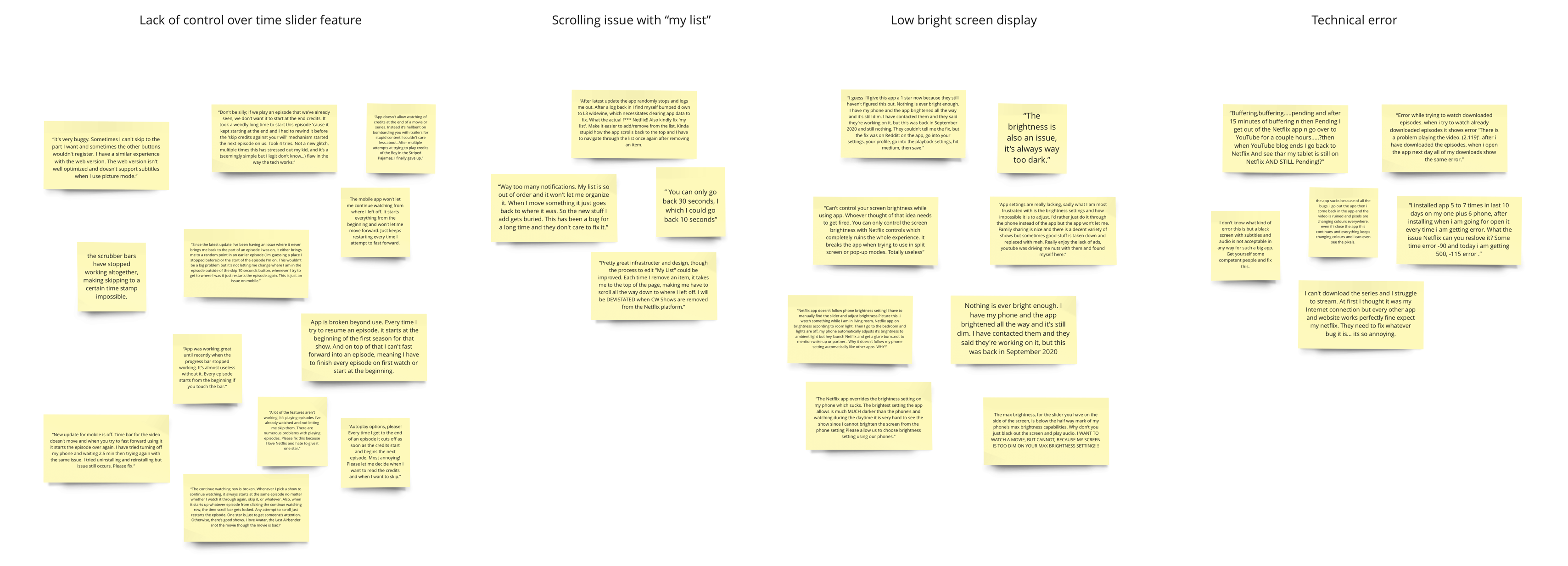
The inability to manage where a time slider goes stood out to me the most for two reasons:
- Being able to control what you watch, when you want to watch is what originally brought Netflix success
- A time scroll feature which lacks sensitivity is an accessibility issue because it excludes individuals with limited mobility from meaningfully engaging with the service
Secondary research
Secondary research
Secondary research
Secondary research
Secondary research
In order to design a feature which enhances the way streamers naturally interact with their show, I need to find out, in what situation, would consumers find themselves wanting more control over the time slider? I did a google search finding information about the entertainment industry, user demographics and the psychology of movie watching to uncover motivations for streaming. The following was discovered:
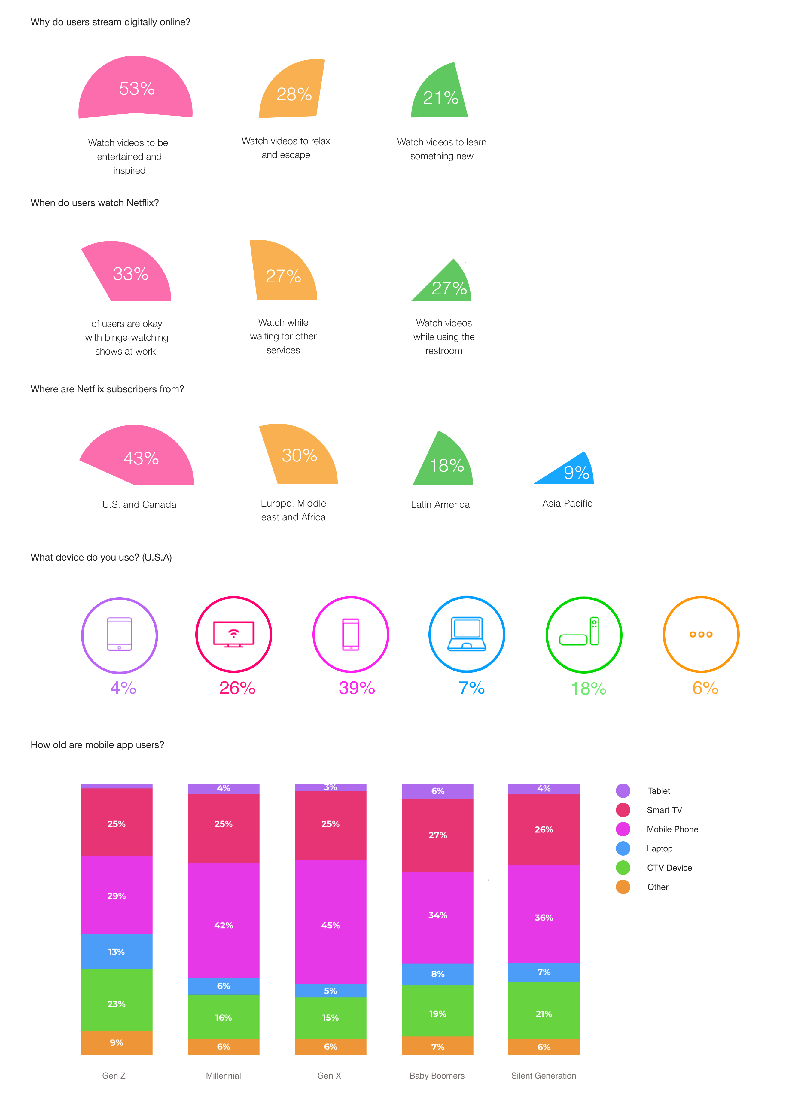
Through research, I discover that, users find opportunities to stream while on the go, people around the world subscribe to Netflix and millennials are more likely to stream on their smart phones. Learning that users watch in order to be entertained, inspired, or learn something new, made me form the assumption that ours users hold some appreciation for the film itself and would like to rewatch or explore within it. This coincides with customer reviews as many consumers reported wanting to watch the credits but being unable to do so as a result of the auto-playback feature and faulty time-slider. I can also form the assumption that users might like taking breaks when watching a film to get a snack, do a chore, talk on the phone etc.
Survey poll
Survey poll
Survey poll
Survey poll
Survey poll
In order to test these assumptions and clarify the streamers intent for using the time-slider, I created a survey and distributed them within digital streaming related forums and UX groups. I received the following answers:
Assumptions:
Users hold some appreciation for the film itself and would like to rewatch or explore within it
Users will not stand still to watch a show all of the way through (pause to eat something, pause to do a chore, pause to talk to someone on the phone, pause due to over stimulation)
Users will prefer to savor a show rather than be over stimulated with a lot of options
Takeaway:
35% of users will only binge a maximum of 2 shows per session
The majority of users will pause an episode they are watching for a variety of different reasons
That pause time, however, does not last more than 10 minutes for 55 percent of users
When they do come back from that break, 55 percent of users will rewind the episode before continuing to watch
90% of users watch 2 series at a time
Only 10% of users watch the end credits
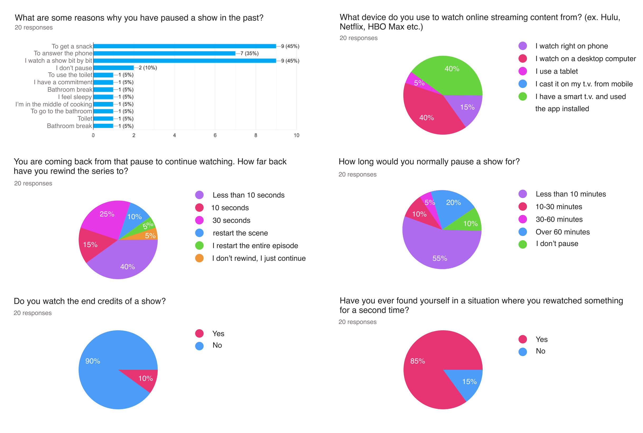
It was interesting to learn that 90% of users pause an episode to take a break to use the restroom, get a snack or fulfill a responsibility. 55% of users would rewind an episode when they come back. Over a third of those participants would rewind a clip back 30 seconds or more after taking a pause. This demonstrates the need for a time scroll which allows users to rewind for larger time jumps as Netflix’s current slider only allows users to rewind in increments of 10 seconds.
Competitor analysis
Competitor analysis
Competitor analysis
Competitor analysis
Competitor analysis
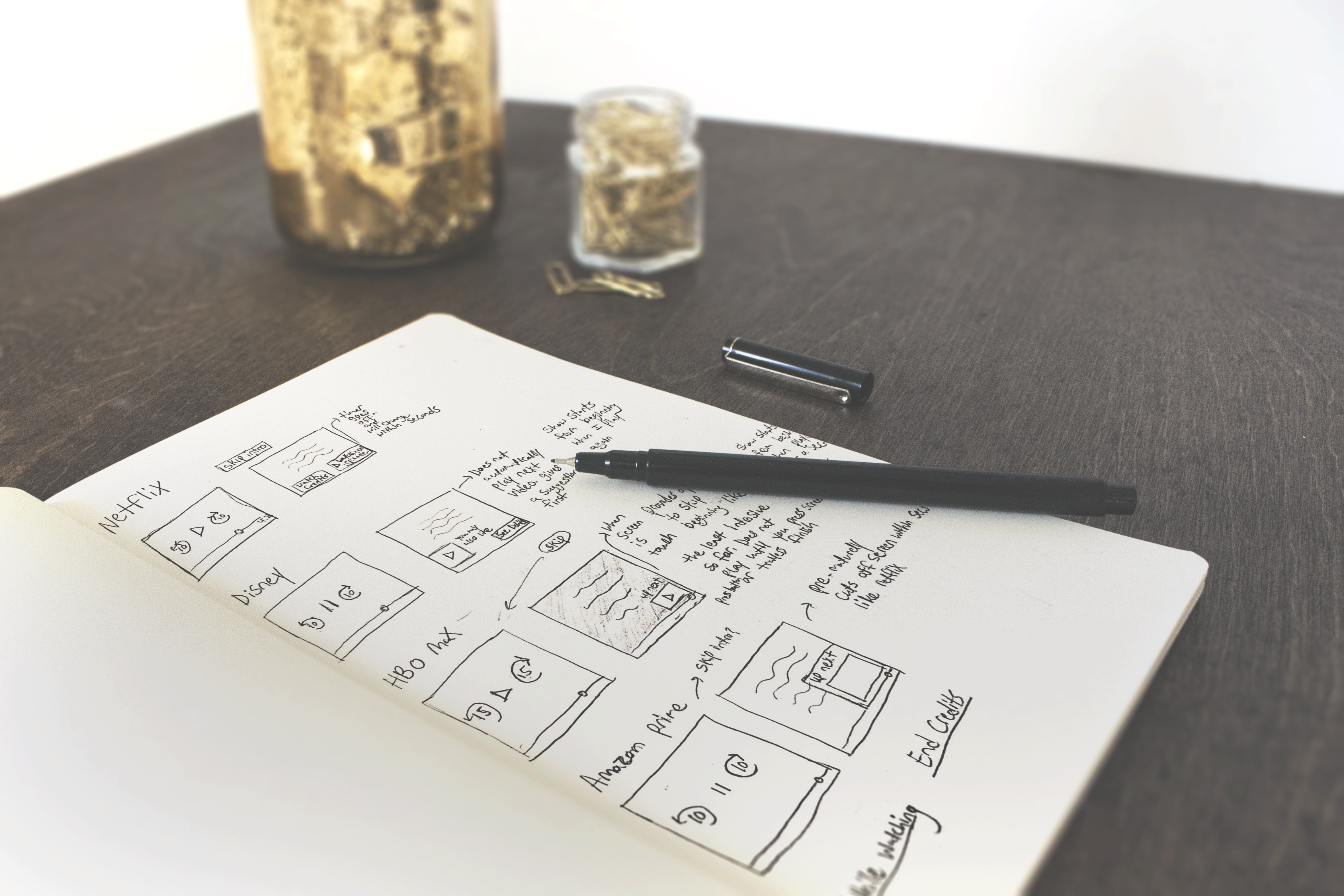
Using all of the data collected, I performed a design audit on HBO Max, Netflix, Disney Plus and Amazon Prime. I used the following questions as a guide:
In what way is this application solving the accessibility issue of having an insensitive timeslider?
Do users have the option of skipping over 30 minutes?
Can users find a specific scene with ease?
Sketch Exercise
To my surprise, no other company gave users the secondary option of skipping more than 10 seconds, at a time. The exception being HBO max which grants users the one option to skip every 15 seconds, however, does not address the accessibility issue of an insensitive time slider or rewinding for larger gaps of time.
Explorative interview
Explorative Interview
Explorative Interview
Explorative Interview
Explorative Interview
Quantitative data helped us determine what was happening as users streamed, but not the why or how it happens. As a result, I interviewed three Netflix mobile app streamers to collect qualitative information, gaining a more complete story of the user’s journey. I then organized key findings into an affinity map to distinguish recurring answer trends.
Assumptions:
Viewers pause in between shows
Users do not enjoy credits but still prefers a break in between sessions
Users rewind more than 10 seconds after a pause
Takeaway:
Users do not pay full attention to the T.V. as they like to distract themselves with noise
Streamers will rewind more than a minute if they missed an important part
Users would rewatch an episode or scene they enjoy
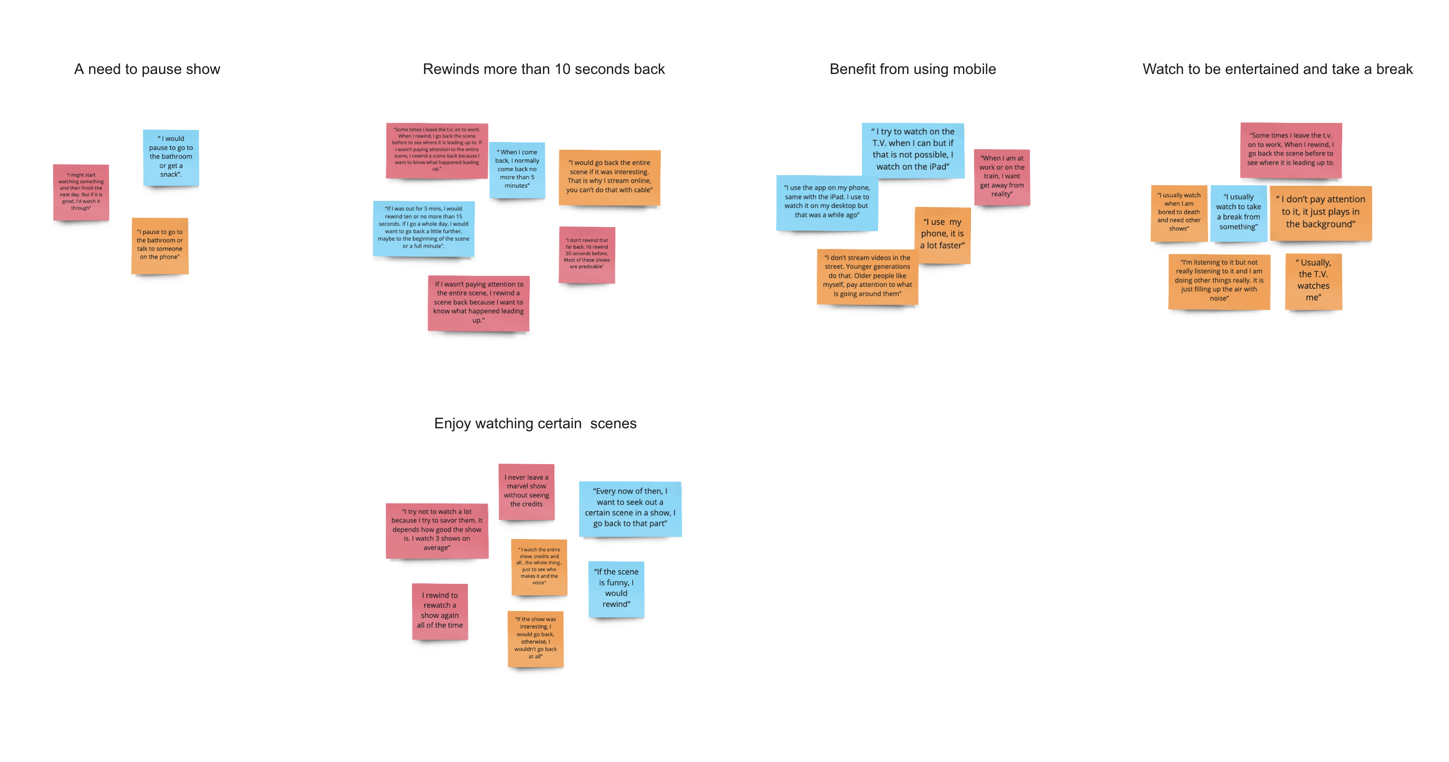
The previous survey showed that streamers often watch shows on their television. This information relates to secondary research as Netflix reports that new subscribers usually start on their phone then gradually develop a preference for streaming on a television screen. A perk for streaming on the T.V. could be, not only watching on a larger screen, but also having access to a remote which allows accurate time-stamping unlike the mobile app time-slider.
Although people report having a stronger preference for watching on a bigger screen, interviewers were able to determine instances where they would and have used their phones to stream in the past such as being at work, watching alone, traveling or casting using an external device.
It was interesting seeing a discrepancy between how much users think they would rewind a show back till and actual behavior. For example, two interviewers said that they would not rewind at all after pausing because they have a good memory, however, they both named plenty of instances where they rewinded an entire scene to understand the context of a punchline. This demonstrates that I am exploring unconscious cognitive biases as users are not self-aware of what they actually do. As a result, they take full accountability for a flaw found within the app.
Opportunities:
A feature which will allow users to go back a scene in case they missed something important
A way of rewinding both in short and large spurts to accommodate different situations (rewatch a scene, rehearse dialogue, refresh their memory after taking a long pause)
Defining our user
Defining our user
Defining our user
Defining our user personas
Defining our user
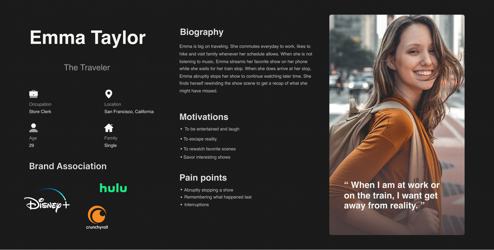
The following user personas were created to reflect our target audience. Demographics between users vary by country and age levels, however, relate in their shared need of stimulating their senses either by creating background noise or entertaining themselves while commuting.

Ideation
Ideation
Ideation
Ideation
Ideation
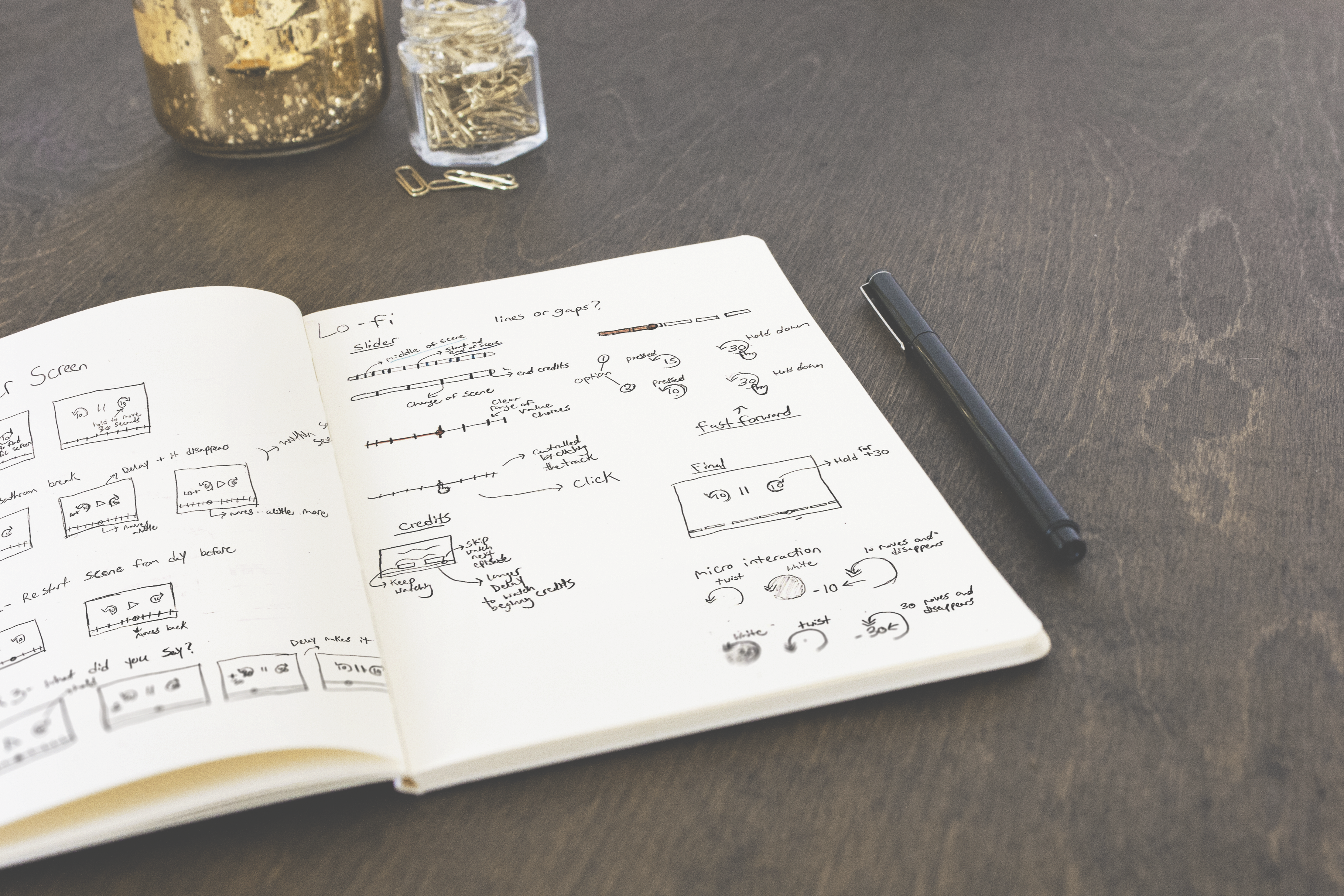
Using google's material design guideline, I explored and experimented with discrete and continuous sliders. I began sketching different solutions to the following conditions:
Our device will need to:
Provide opportunities to skip both large and short distances
Provide opportunities to find specific scenes
Usability test
Usability Test
Usability Test
Usability Test
Usability Test
Choosing the solution that best fulfilled user’s needs and motivations, I created a paper prototype which included the newly created UI features. The gaps in the time-slider represented a change in scene transition. Users will be able to hold down the rewind button to change time increments from every 10 seconds to 30 seconds. Tooltips were created to help users adjust to the new feature.

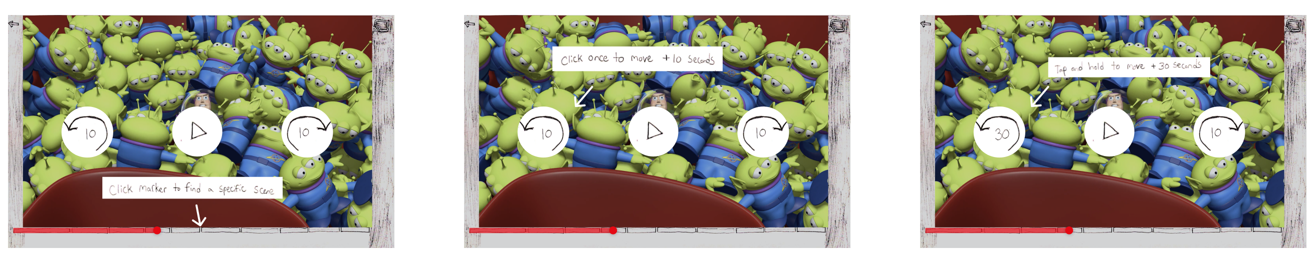
Three user tasks were created and inspired by real scenarios heard through responses from the survey and interviews. Users completed each task using a tablet to mimic real life constraints.

Test objective:
Find out if users are able to intuitively know how to use new slider
Find out if this is easier to use than the original slider
Hypothesis:
Users will be able to successfully and accurately rewind to an intended time stamp.
Users will understand how to use the “ hold and press” 30 second time skip feature
Usability Test Tasks:
Bathroom Break: You just paused your show to take a 5 minute bathroom break. You want to rewind the show 20 seconds beforehand to get a small recap. How would you do that?
Restart Scene from yesterday: You are watching a show and you lost track of time! You have a family obligation to attend to. You pick up where you left off the next day. You want to restart the scene again.
What did they say? Rewind 1 minute back: You are simultaneously streaming T.V. online and completing a project. You missed something important that happened on the show and you want to go back one minute. What would you do to do that?
Results:
All users completed Task 1 without any complications.
As for Task 2, the gap spaces went unnoticed by users. It is possible that users misinterpreted the gaps as commercial ads rather than scene section markers. Rather than clicking on a marker, users used the slider instead.
All users found the use of holding the rewind button to unlock the 30 second feature as a needed tool during Task 3. However, many testers either forgot to activate the 30 second feature button or was confused regarding how they might use it. This could be a result of a usability testing program constraint as the testing app (Invision) does not permit long press gestures.
Iteration 1
Iteration 1
Iteration 1
Iteration 1
Iteration 1
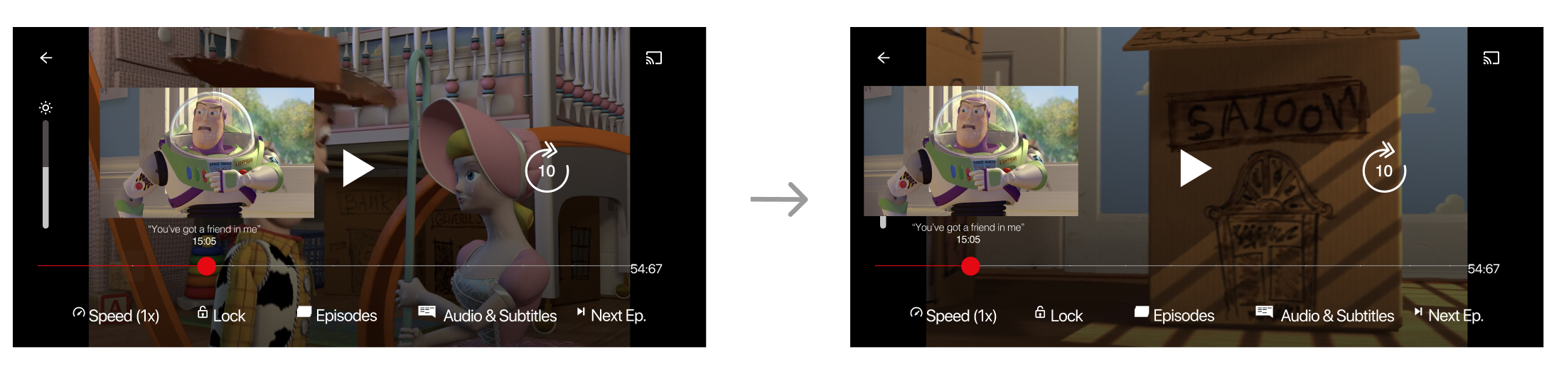
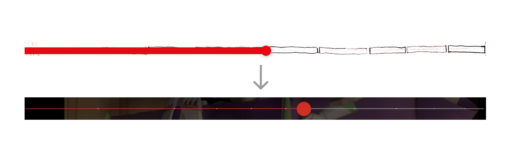
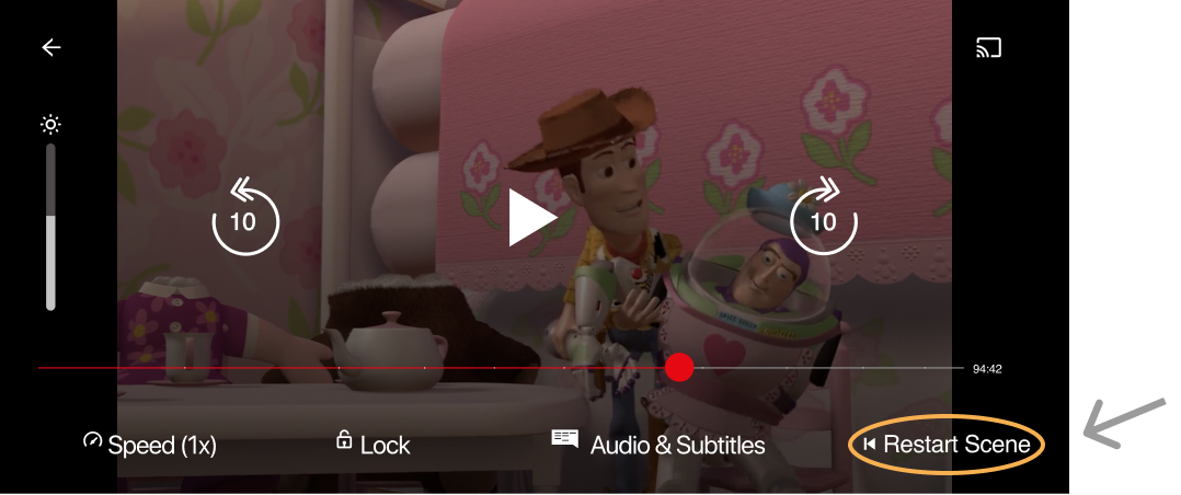
After engaging in a conversation with a mentor and reviewing usability test results, I made iterations to improve my original design. I added a screenshot which became visible whenever someone went back a scene in order to signify a scene transition. I also changed the time-slider marker from a gap to circle so users would be less likely to confuse the indicators with commercial intermissions. Since many testers overlooked the “hold to skip +30 secs” feature, tooltips will no longer automatically play and will require the user to tap the screen before proceeding. Since many users reported only binging 2 episodes at a time, I made modifications to the lower navigation section by replacing the “next episode” with “restart scene”. Based on research, users are more likely to rewind to understand confusing dialogue, than they are to see the newt episode. A “restart scene” button made more sense for that prime interface real estate.
Update scene transitions:
Add a screenshot whenever user skips to indicate a transition from one scene to the next
Update scene transitions:
Change gaps into circles to make intention clear
Iteration 2
Iteration 2
Iteration 2
Iteration 2
Iteration 2
Update quick keys:
Users will now have the option to restart a scene with one click
Final prototype
Final Prototype
Final Prototype
Final Prototype
Final Prototype
Hold to rewind +30 seconds and slide to the start of scene
Reflection
Reflection
Reflection
Reflection
Reflection
I believe a discrete slider and the option to manage time jump intervals, would ultimately give streamers more control over what they watch. It was interesting learning about the digital entertainment industry and the habits users form while streaming. Most users will take a break from watching a show for a variety of different reasons and the majority of them will rewind to get a recap of what happened prior. If I could re-do one aspect of the project, it would be to modify the survey question which investigates how far back a person would rewind after returning from a pause to include the option to select minutes, rather than just seconds. This could have yielded different results.
More projects
More project
More projects
More Projects
More Projects
THOUGHTFUL
Boosting Retention by unlocking user ‘Aha’ Moment.
Product discovery • iOS Mobile
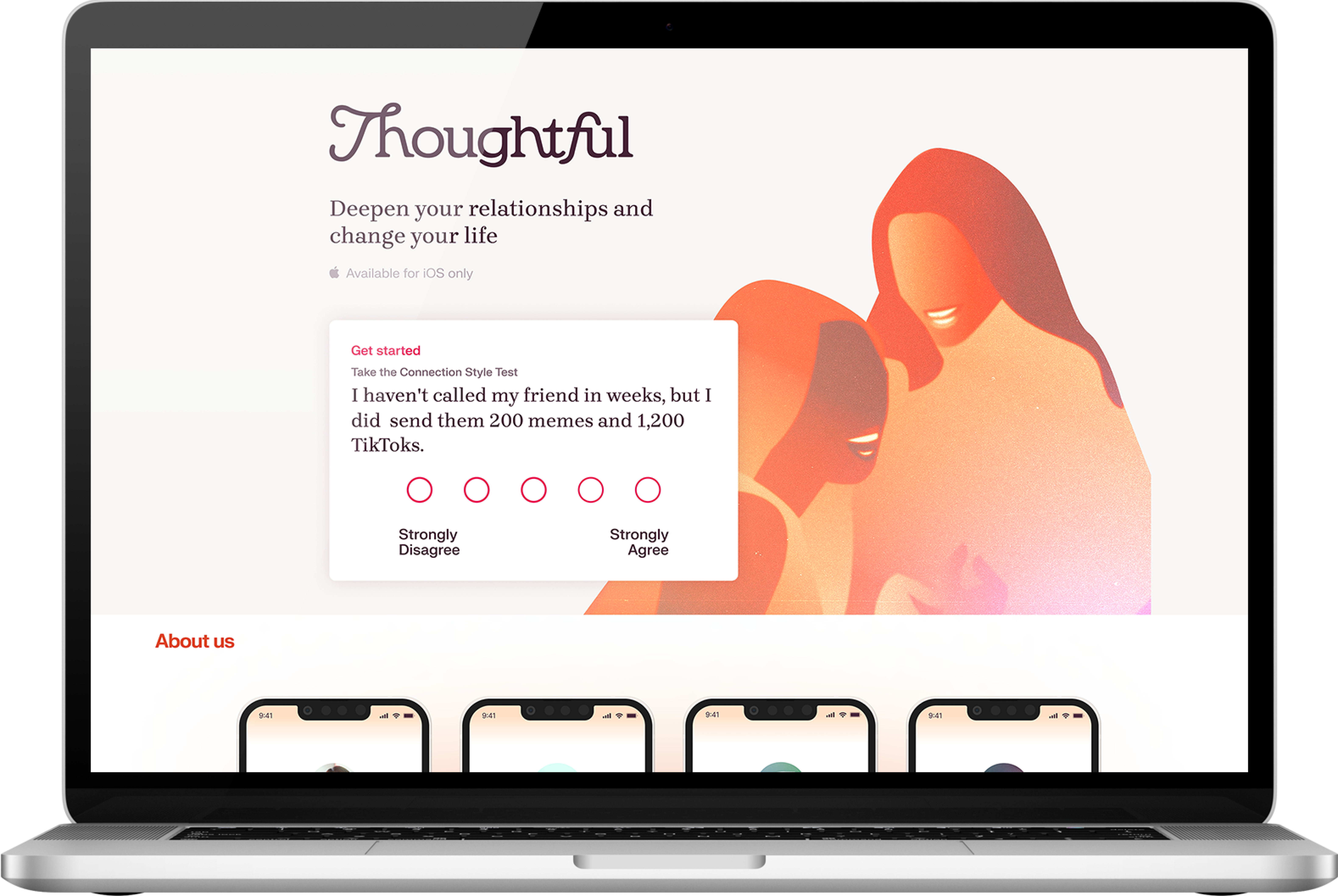
THOUGHTFUL
Fixing a leaky customer funnel.
Growth • B2C SaaS • Animation
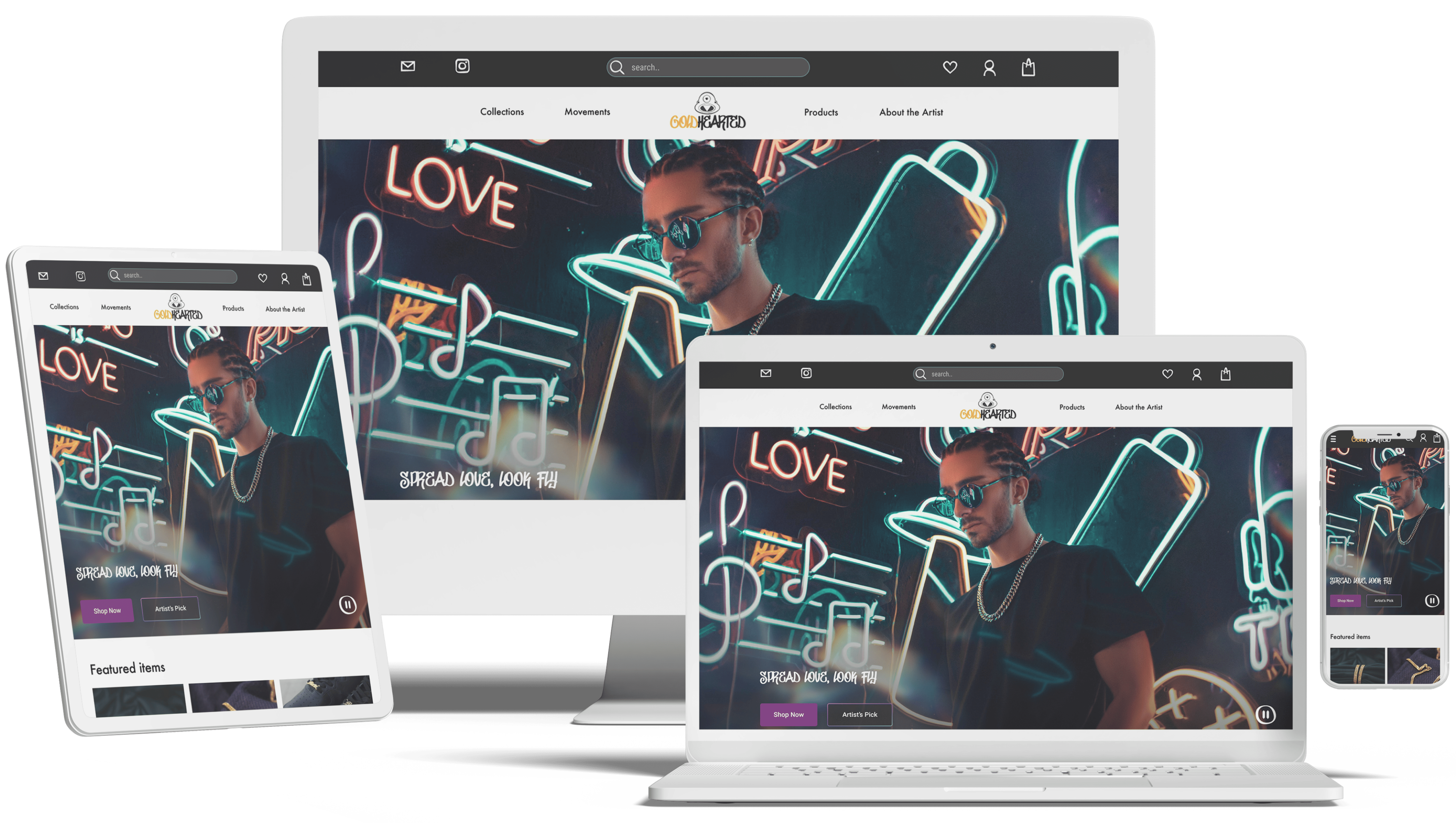
GOLD HEARTED
Rebrand a jewelry company for market fit.
Responsive • E-commerce • Visual

ANIMAL CARE CENTERS
Feature to reunite lost pets with owners.
Add a feature • Database • AI