


Project
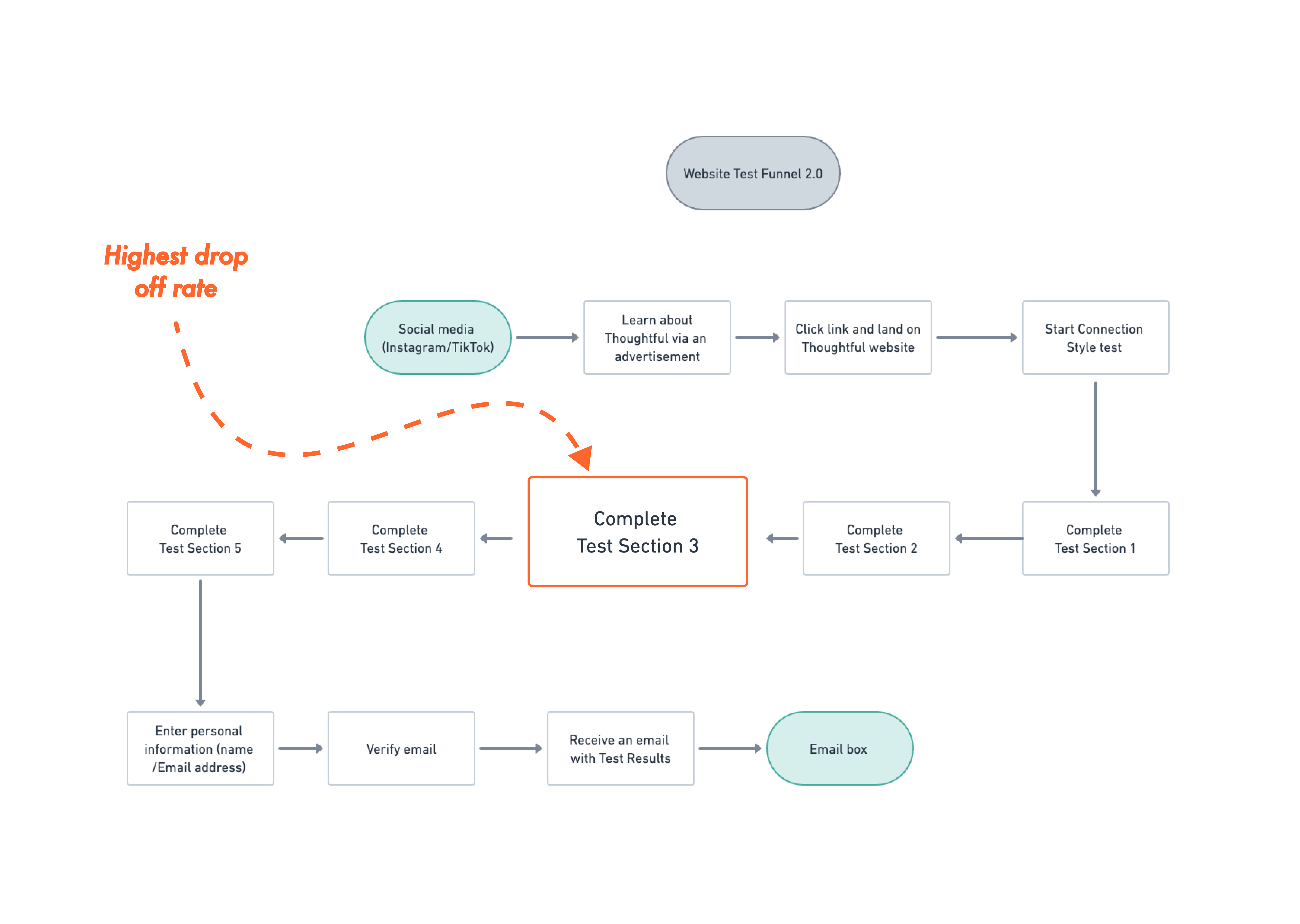
Thoughtful, an emerging mobile app startup dedicated to fostering deeper connections and combating loneliness, teamed up with a group of psychiatrists to create the Connection Style test. This 40 question website test, which serves as a conversion funnel for the mobile app, is designed to help time constrained and career oriented individuals understand their strengths and hurdles within interpersonal dynamics. Once completed, users are met with a gate where they are prompted to enter their information and receive their results through an Email.
Thoughtful, an emerging mobile app startup dedicated to fostering deeper connections and combating loneliness, teamed up with a group of psychiatrists to create the Connection Style test. This 40 question website test, which serves as a conversion funnel for the mobile app, is designed to help time constrained and career oriented individuals understand their strengths and hurdles within interpersonal dynamics. Once completed, users are met with a gate where they are prompted to enter their information and receive their results through an Email.
Thoughtful, an emerging mobile app startup dedicated to fostering deeper connections and combating loneliness, teamed up with a group of psychiatrists to create the Connection Style test. This 40 question website test, which serves as a conversion funnel for the mobile app, is designed to help time constrained and career oriented individuals understand their strengths and hurdles within interpersonal dynamics. Once completed, users are met with a gate where they are prompted to enter their information and receive their results through an Email.
Thoughtful, an emerging mobile app startup dedicated to fostering deeper connections and combating loneliness, teamed up with a group of psychiatrists to create the Connection Style test. This 40 question website test, which serves as a conversion funnel for the mobile app, is designed to help time constrained and career oriented individuals understand their strengths and hurdles within interpersonal dynamics. Once completed, users are met with a gate where they are prompted to enter their information and receive their results through an Email.
Thoughtful, an emerging mobile app startup dedicated to fostering deeper connections and combating loneliness, teamed up with a group of psychiatrists to create the Connection Style test. This 40 question website test, which serves as a conversion funnel for the mobile app, is designed to help time constrained and career oriented individuals understand their strengths and hurdles within interpersonal dynamics. Once completed, users are met with a gate where they are prompted to enter their information and receive their results through an Email.
Time
August 2023
August 2023
August 2023
August 2023
August 2023
Role
Product Designer
Product Designer
Product Designer
Product Designer
Product Designer
Tools
Figma, Whimsical, Illustrator, Photoshop
Figma, Whimsical, Illustrator, Photoshop
Figma, Whimsical, Illustrator, Photoshop
Figma, Whimsical, Illustrator, Photoshop
Figma, Whimsical, Illustrator, Photoshop
Challenge
Helping an emerging startup identify why users fail to complete a web test funnel and developing solutions to enhance conversions.
Helping an emerging startup identify why users fail to complete a web test funnel and developing solutions to enhance conversions.
Helping an emerging startup identify why users fail to complete a web test funnel and developing solutions to enhance conversions.
Helping an emerging startup identify why users fail to complete a web test funnel and developing solutions to enhance conversions.
Helping an emerging startup identify why users fail to complete a web test funnel and developing solutions to enhance conversions.
Solution
- Subtle and ambiguous progress counter
- Intermittent test section dividers providing refreshing visual pauses
Satisfying water animation loader - Visual illustrations that captures the brand's values and mission
- Subtle and ambiguous progress counter
- Intermittent test section dividers providing refreshing visual pauses
Satisfying water animation loader - Visual illustrations that captures the brand's values and mission
- Subtle and ambiguous progress counter
- Intermittent test section dividers providing refreshing visual pauses
Satisfying water animation loader - Visual illustrations that captures the brand's values and mission
- Subtle and ambiguous progress counter
- Intermittent test section dividers providing refreshing visual pauses
Satisfying water animation loader - Visual illustrations that captures the brand's values and mission
- Subtle and ambiguous progress counter
- Intermittent test section dividers providing refreshing visual pauses
Satisfying water animation loader - Visual illustrations that captures the brand's values and mission
The Problem
Problem
Problem
Problem
Problem
The test conversion funnel had a high bounce-off rate as many users exited the test before completion. We wanted to improve the test by finding a way to engage users who struggled to sustain motivation.
A major constraint during this period was a lack of time to involve qualitative interviews from test-takers to learn more about why someone would leave the test early. I was able to draw on my background as a behavioral health clinician to formulate a few assumptions around motivation, which would later be validated by metrics.
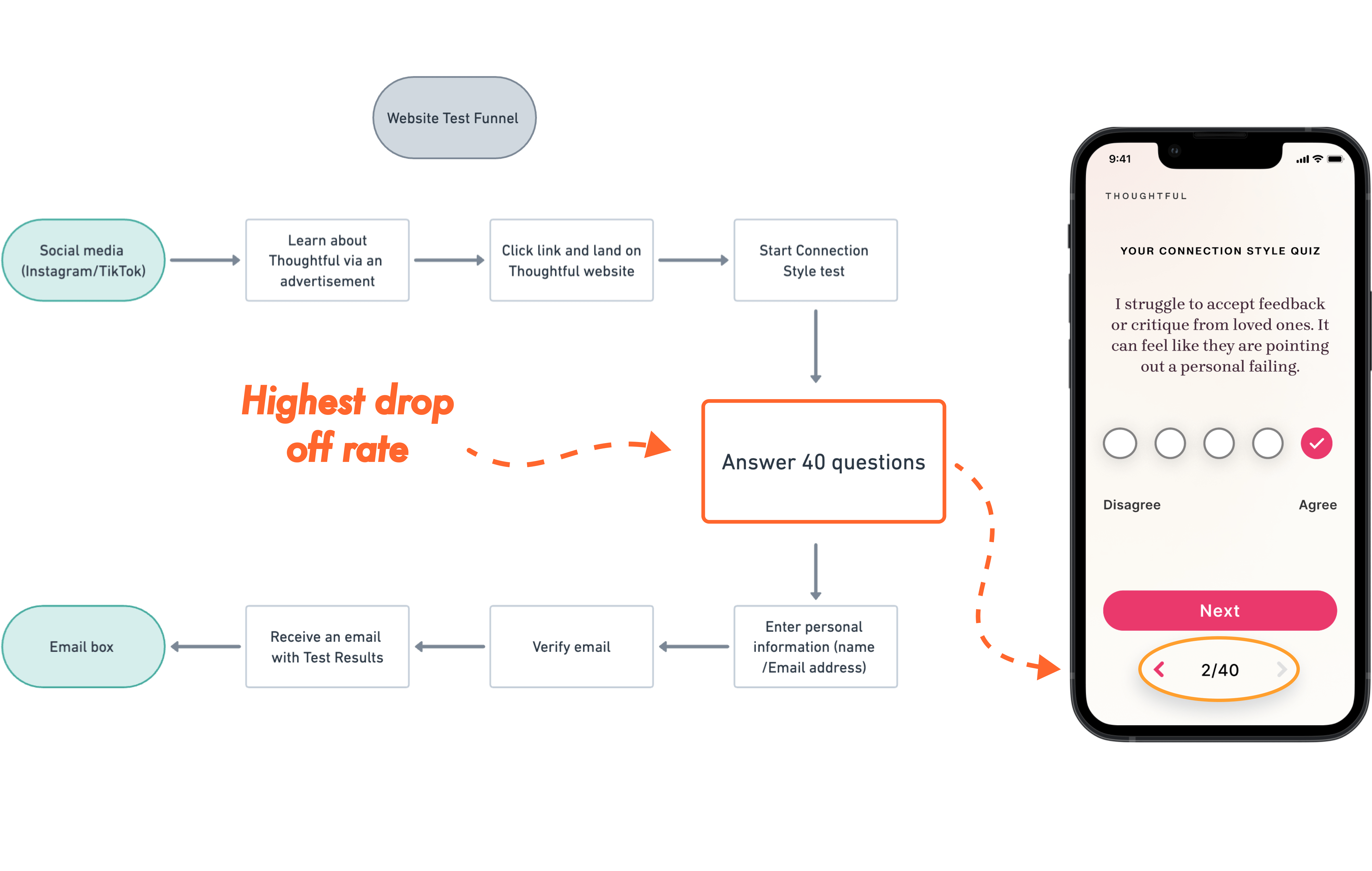
Considering our targeted demographic is career-oriented and has limited time, I originally assumed they wouldn't have the patience to go through a long questionnaire.
"There are a lot of questions to go through. Do we need that many to determine their connection style?" I asked. I was told we didn't necessarily need 40 questions, but giving the test weight could make the test seem credible.
Without adjusting the number of questions, I assumed users would be motivated to complete the test if the design felt "airy" and kept them in a flow state. We could section out the test questions with section dividers to act as a palette cleanser or resting moment.
Ideation 1.0
Ideation 1.0
Ideation 1.0
Ideation 1.0
Ideation 1.0
Using Care/Of’s test section divider page as a reference...
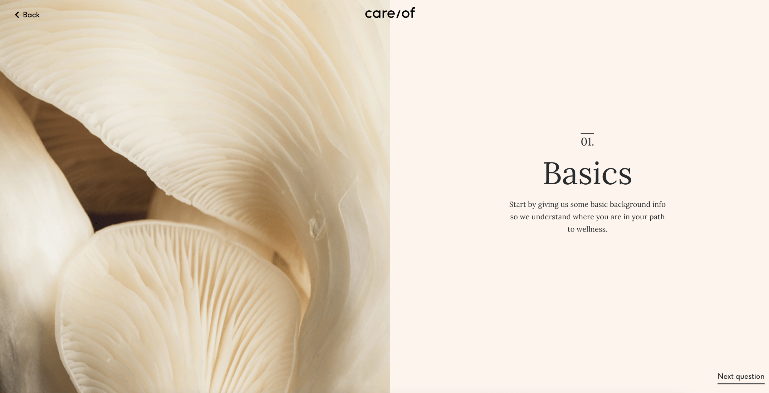
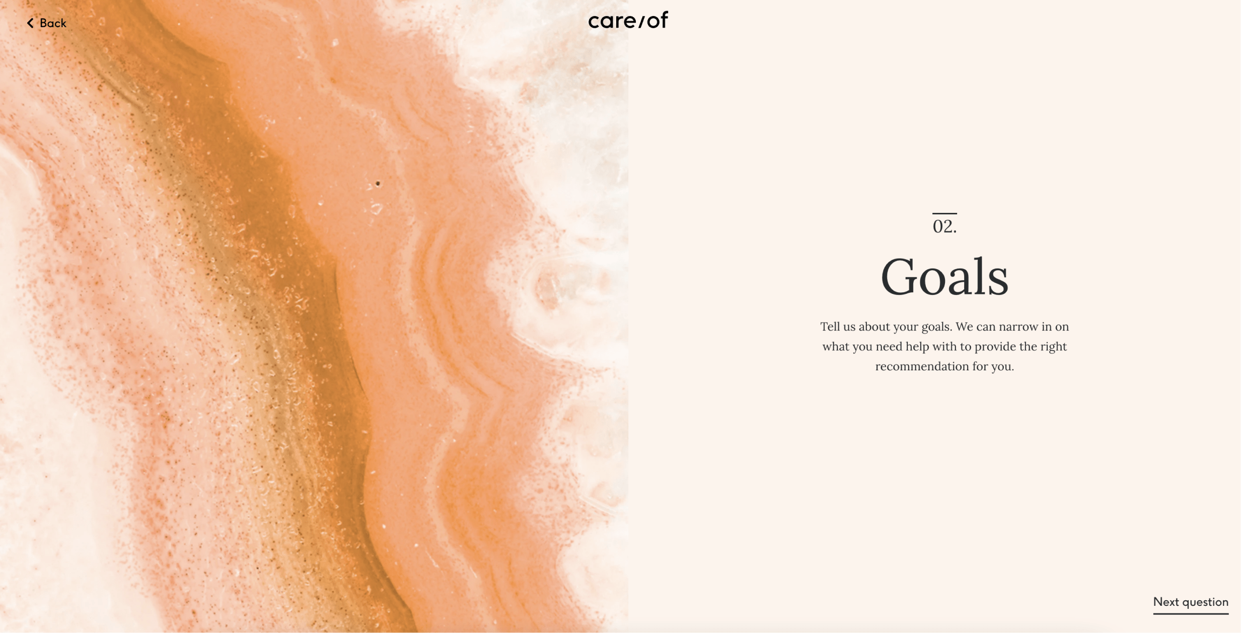
and after sketching and exploring a few concepts...
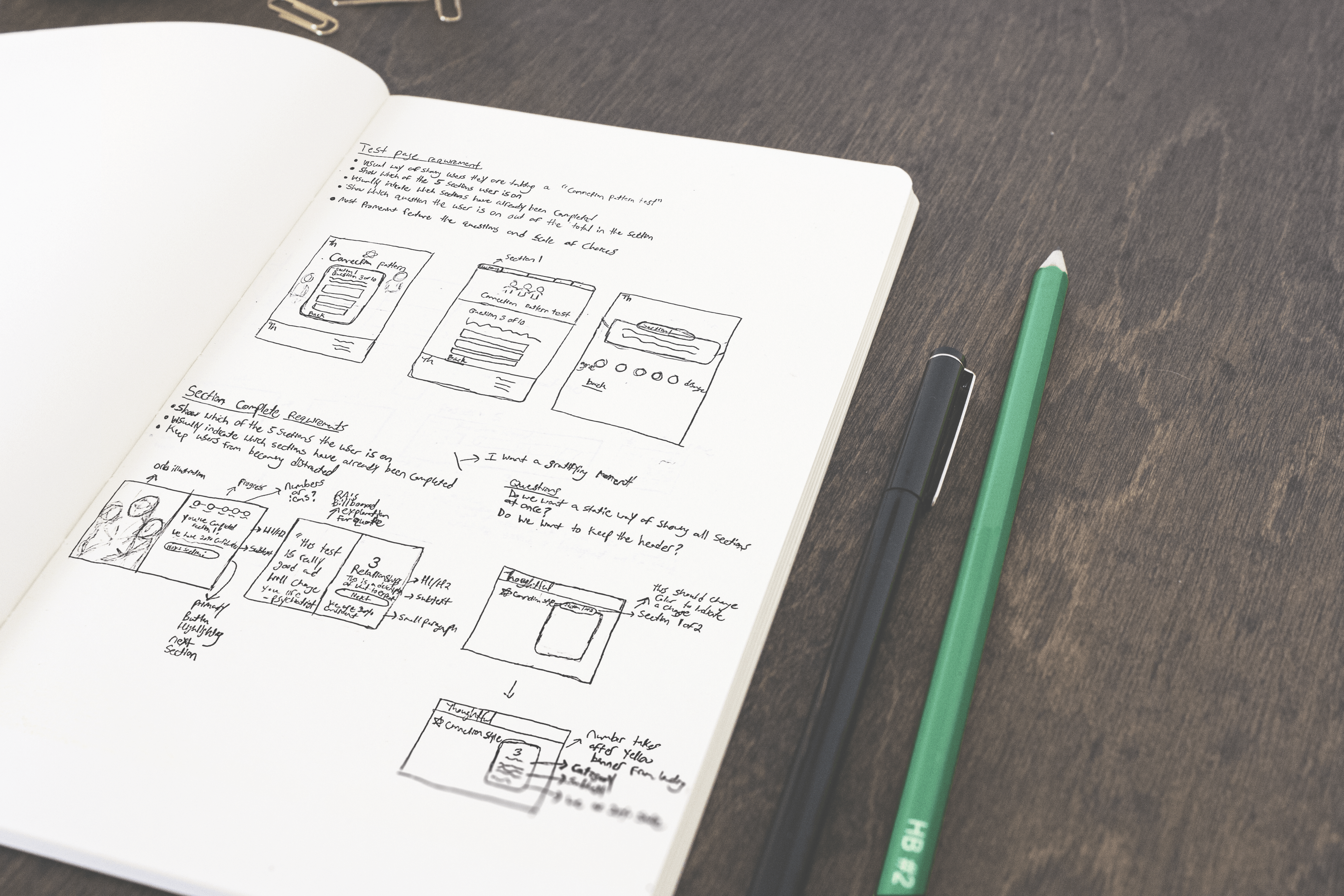
we eventually landed on the following designs for the test question and section divider views.
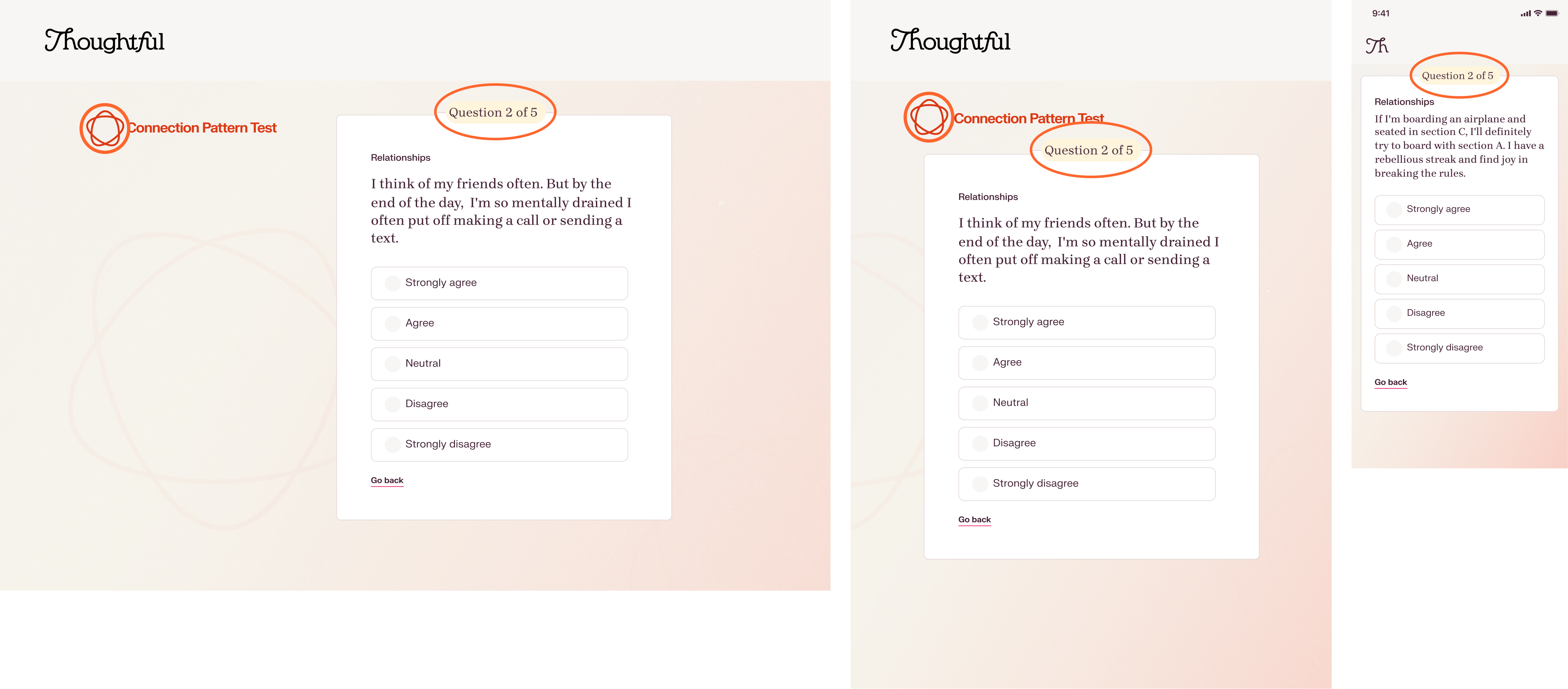
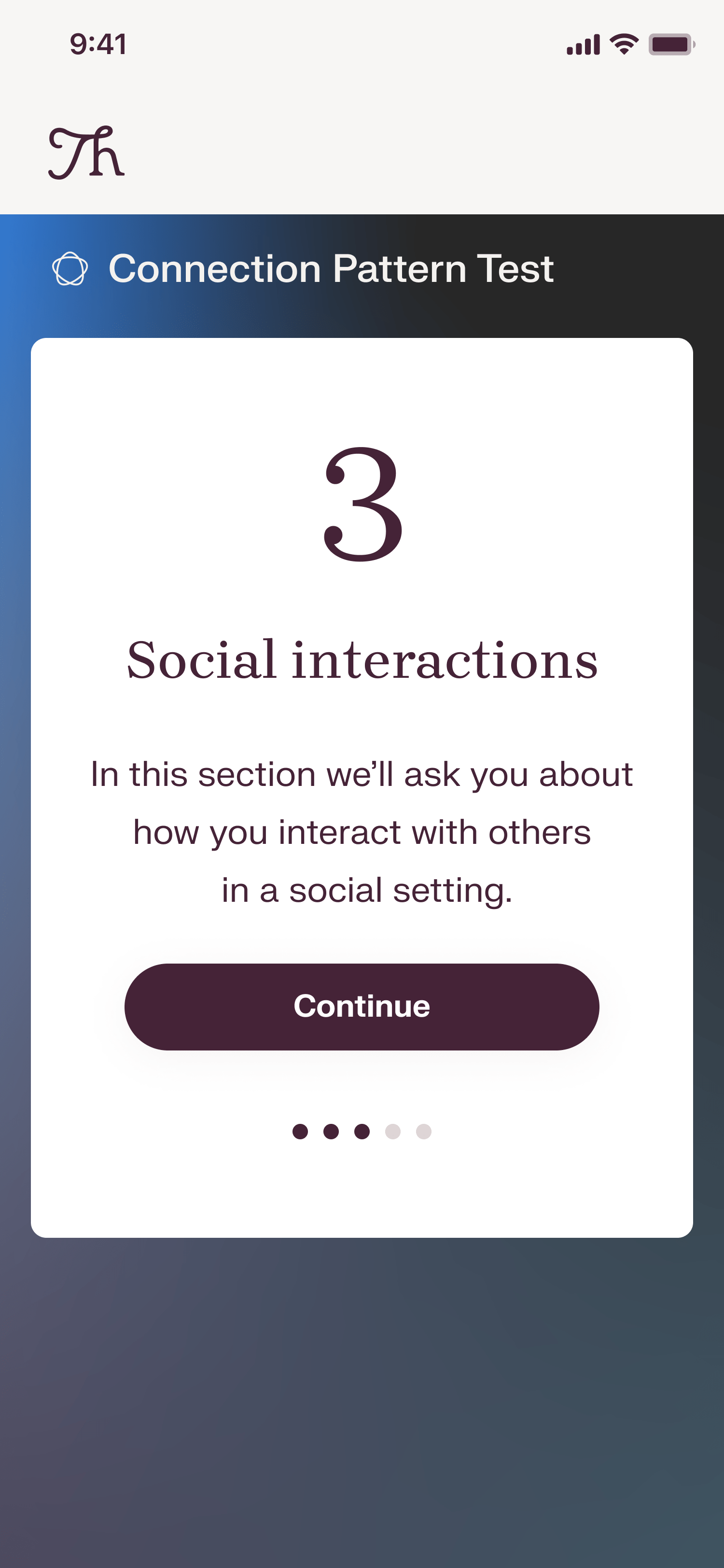
On top of each test question card, there is a counter which indicates how many questions are left within that specific section rather than the entire test. We assumed this would help minimize the appearance of a dauntingly long 40-question test, which could help motivate the user to continue until the end.
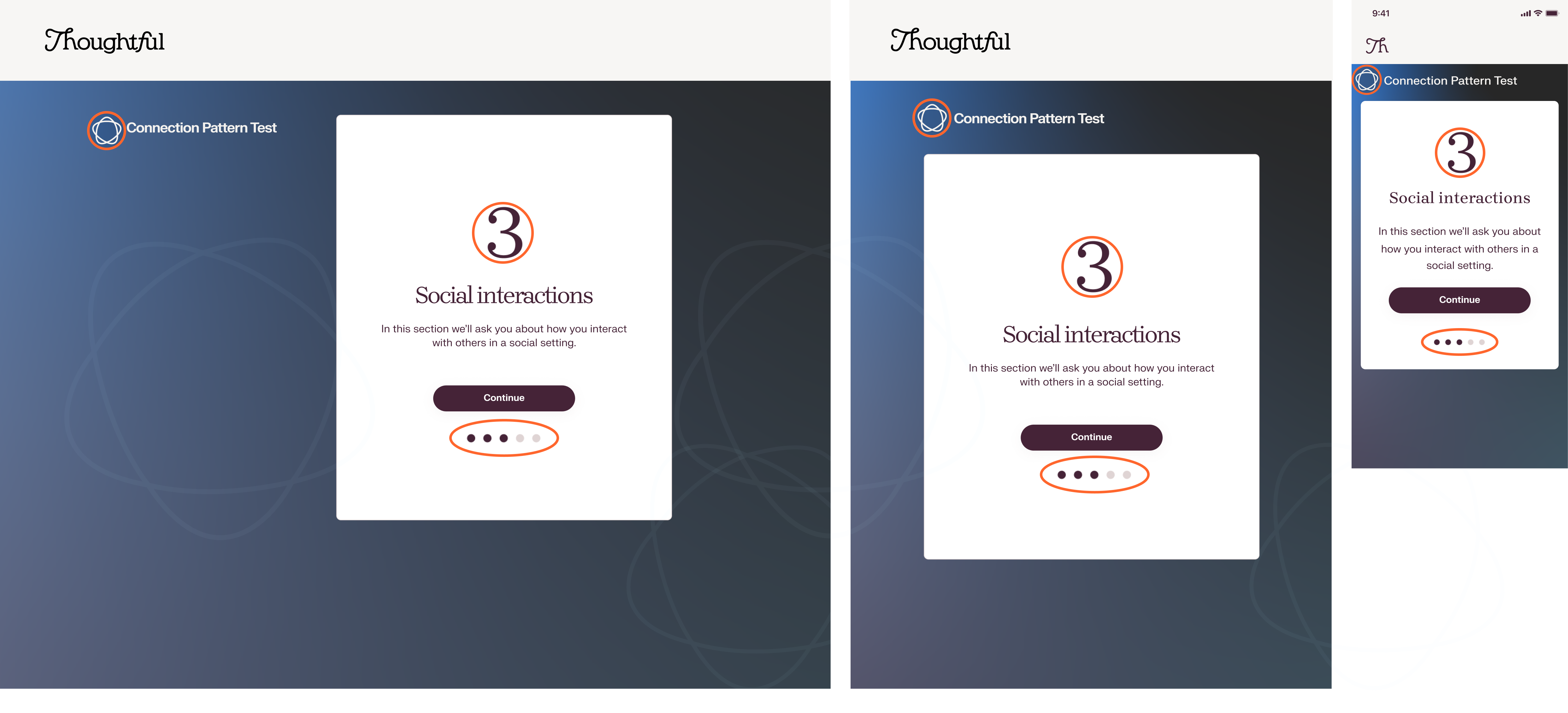
For the section dividers, we assumed including paginations •••◦◦ and a large section number could ground users temporally, giving them a sense of premature completion, motivating them to continue. I also designed the atom icon which brands the test as valid and scientific. The dark blue color psychology establishes a feeling of authority.
The data was in, and it wasn't what we hoped for - our new design didn't budge the conversion numbers.
Ideation 2.0
Ideation 2.0
Ideation 2.0
Ideation 2.0
Ideation 2.0
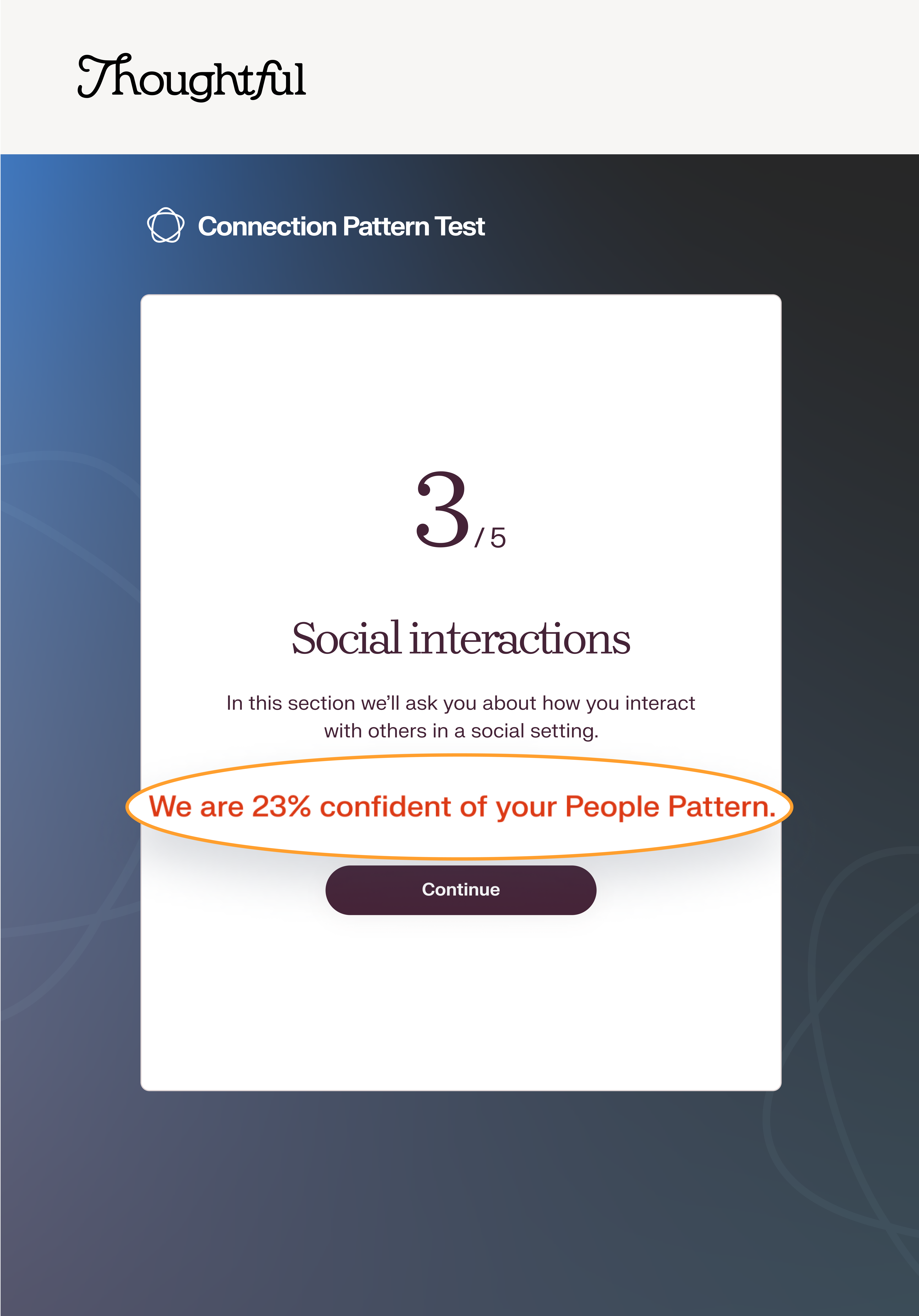
“Maybe we need to fill the user with confidence about the test?” The product owner suggested placing a statement on the section divider quantifying the user’s test taking results.
A week later, we realized this update lowered the number of email sign-ups, so we undid the changes.
Research and discovery
Research and discovery
Research & discovery
Research & discovery
Research & discovery
I became determined. To understand successful funnels, I researched the topic extensively while analyzing top-performing tests from companies like Sephora, Warby Parker, ThirdLove, and Stitch Fix.
That's when a pattern emerged.
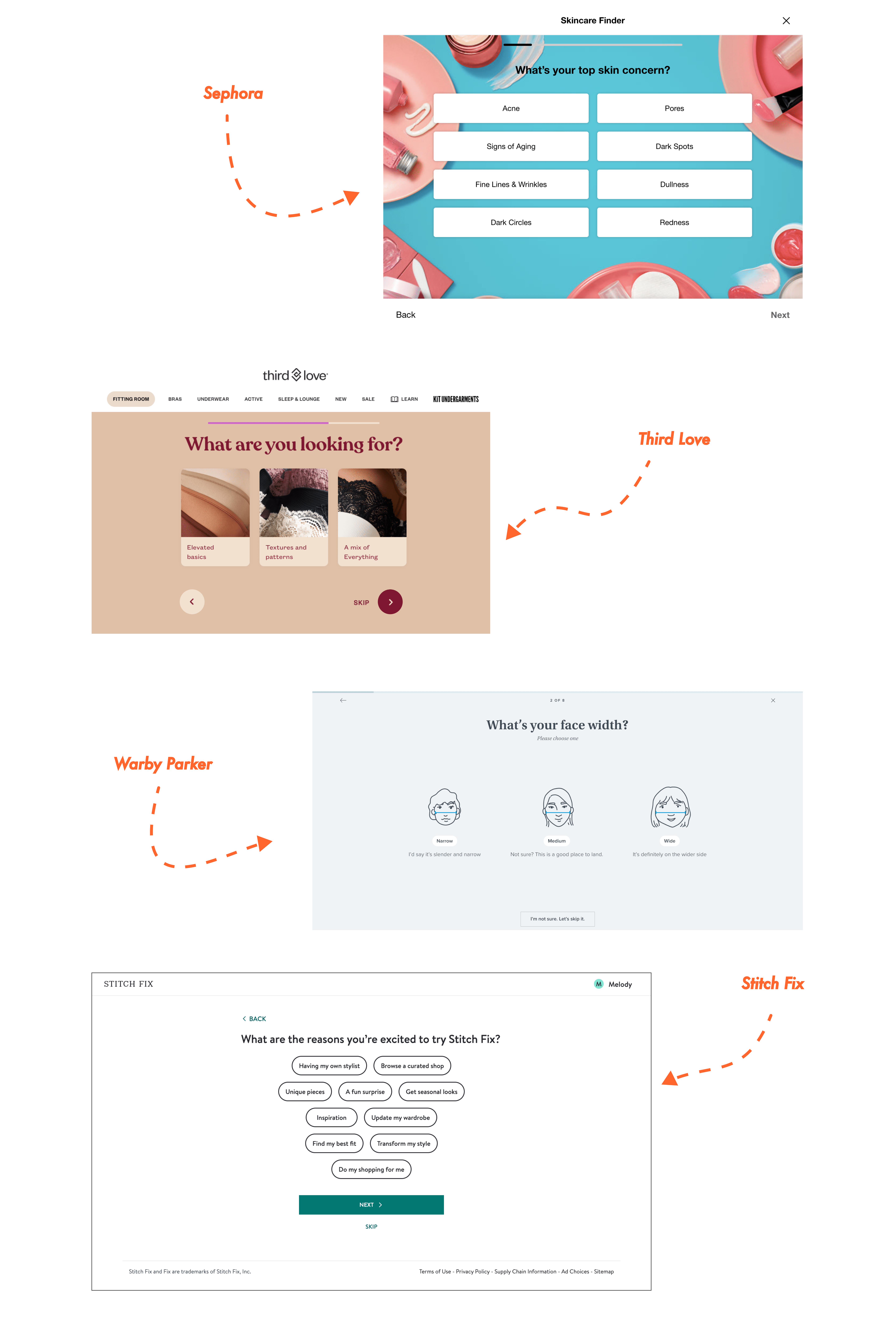
High performing tests had the following similarities in common:
- Visuals to keep the user engaged
- A strong branding component to help the user understand the values and mission of the organization
- A personalized experience with recommendations, insights and results tailored to the user’s specific needs
- Subtle and ambiguous progress counter
- Visuals to keep the user engaged
- A strong branding component to help the user understand the values and mission of the organization
- A personalized experience with recommendations, insights and results tailored to the user’s specific needs
- Subtle and ambiguous progress counter
- Visuals to keep the user engaged
- A strong branding component to help the user understand the values and mission of the organization
- A personalized experience with recommendations, insights and results tailored to the user’s specific needs
- Subtle and ambiguous progress counter
- Visuals to keep the user engaged
- A strong branding component to help the user understand the values and mission of the organization
- A personalized experience with recommendations, insights and results tailored to the user’s specific needs
- Subtle and ambiguous progress counter
- Visuals to keep the user engaged
- A strong branding component to help the user understand the values and mission of the organization
- A personalized experience with recommendations, insights and results tailored to the user’s specific needs
- Subtle and ambiguous progress counter
Ideation 3.0
Ideation 3.0
Ideation 3.0
Ideation 3.0
Ideation 3.0
Based on the observed patterns, I formed the assumption that users might not feel motivated to complete the test because the product offering felt too generalized. I assumed users are more likely to finish if they knew the test brought real value by catering to their specific and unique problem. Users ultimately want to feel seen and understood.
When I originally proposed the idea of creating a customized experience, it was turned down. With fundraising around the corner, the product owner understandably felt that personalization would add more scope than necessary. We instead opted for the illusion of personalization by introducing a view which pinpoints the user’s goals, thus showcasing the different areas in which we bring value.
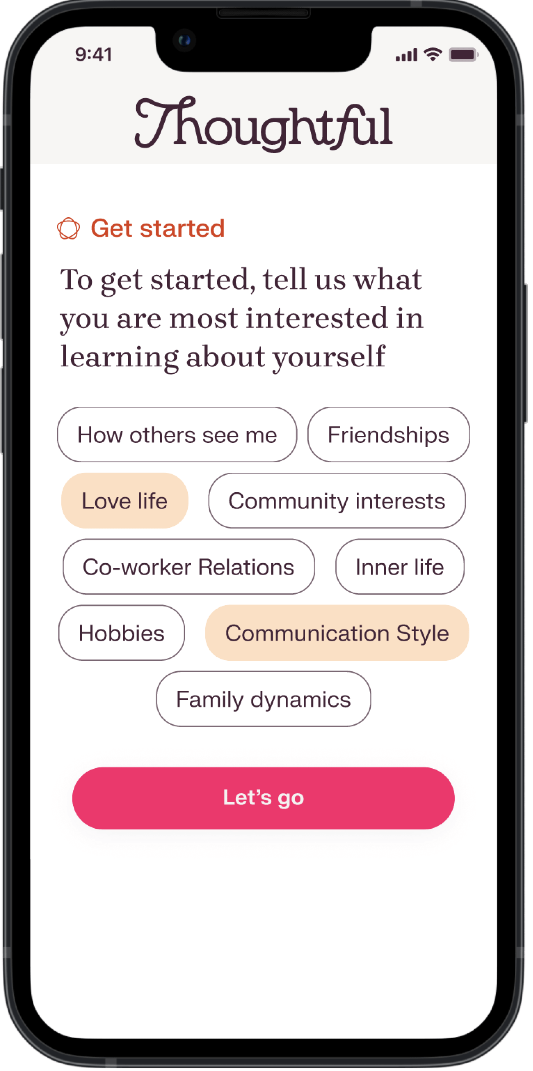
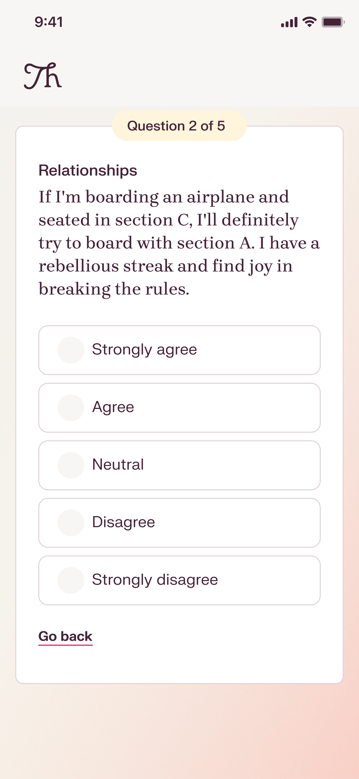
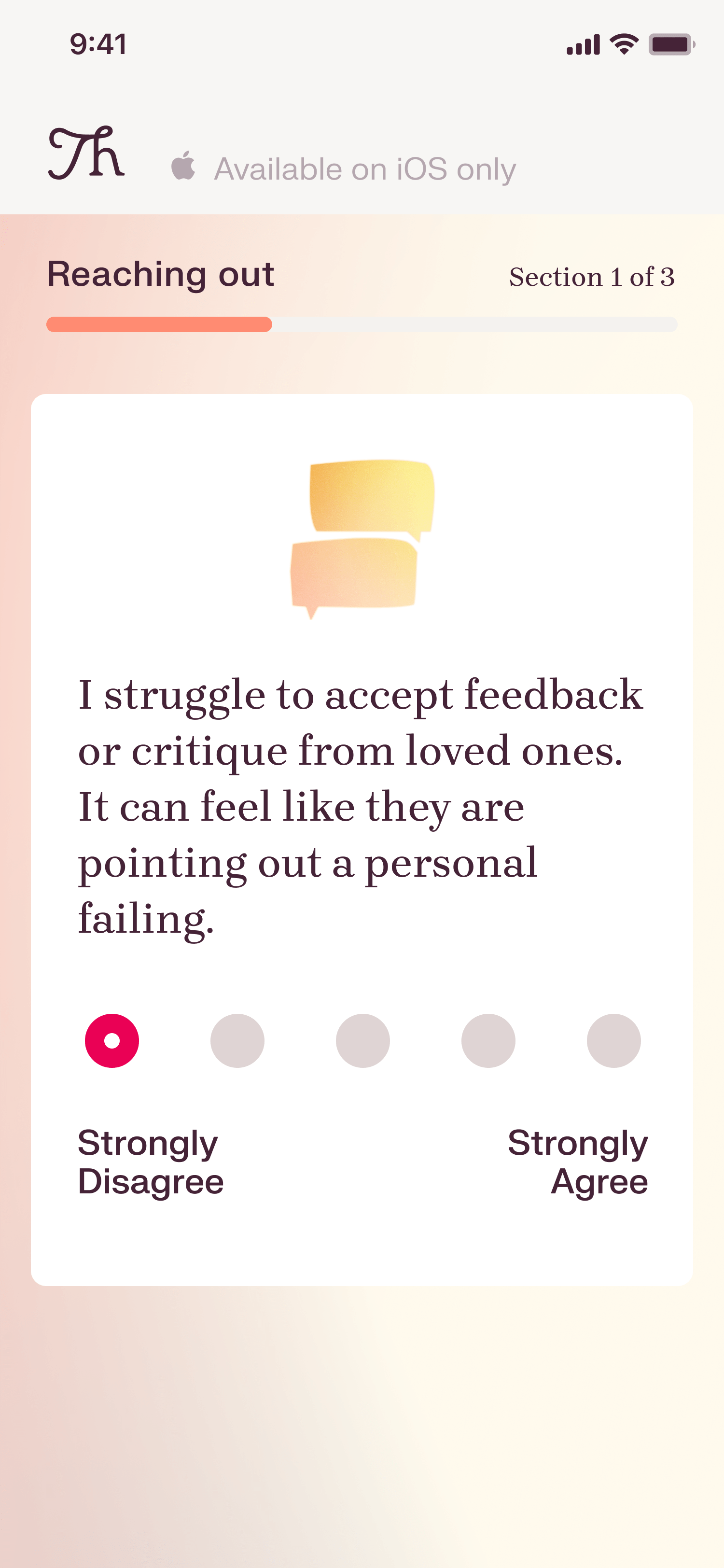
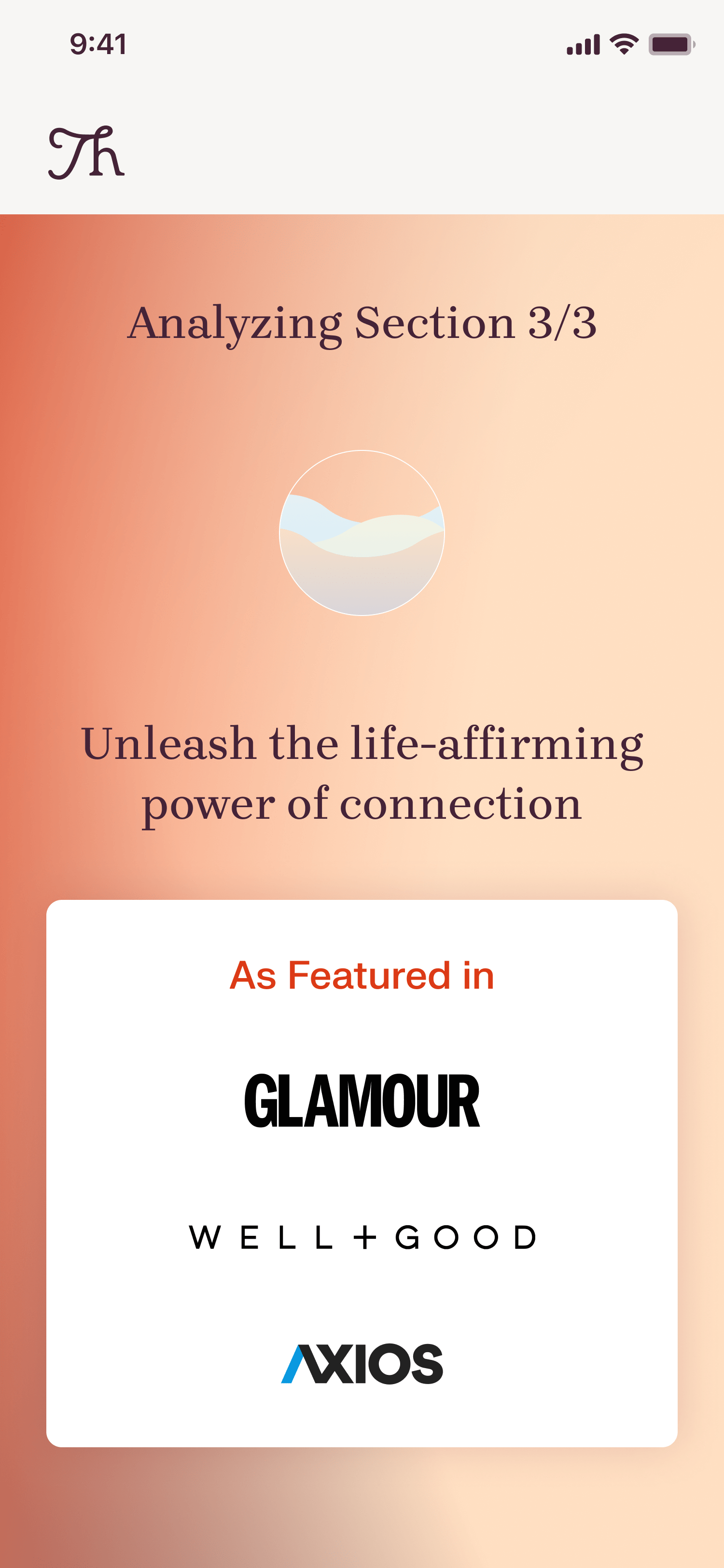
In addition to goal setting, we also introduced visual graphics for the test-taking and section divider views to keep users engaged. The visuals represented the brand's tenets of being thoughtful: Reach out, Reflect, and Remember. Instead of highlighting which question number the user was on, we opted for a subtle counter showing a visual representation of progression to keep the user in a flow state, reducing any apprehension a user might have towards completing the test.
I also designed and animated a visually satisfying water orb loading animation for the section dividers to further increase user engagement.
Our recent tweaks to the customer acquisition funnel have increased the test-taking conversion rate from 56% to 76%. We've successfully achieved 20% more email sign-ups through our optimized funnel.
End product
End product
End product
End product
End product
Reflection
Reflection
Reflection
Reflection
Reflection
For this project, I was tasked with identifying why users failed to complete the full test funnel on Thoughtful's website and developing solutions to enhance email sign-up conversions. One major challenge was the lack of qualitative user interviews, which could have provided valuable insights into user behavior and motivations.
Despite this hurdle, I treated the process like a puzzle to crack. If I could go back, I would conduct a competitive analysis earlier to discover potential patterns sooner.
Overall, this experience has taught me how to become comfortable with ambiguity as I strategized a solution under unclear conditions and continuously iterated based on new learnings.
More projects
More project
More projects
More Projects
More Projects
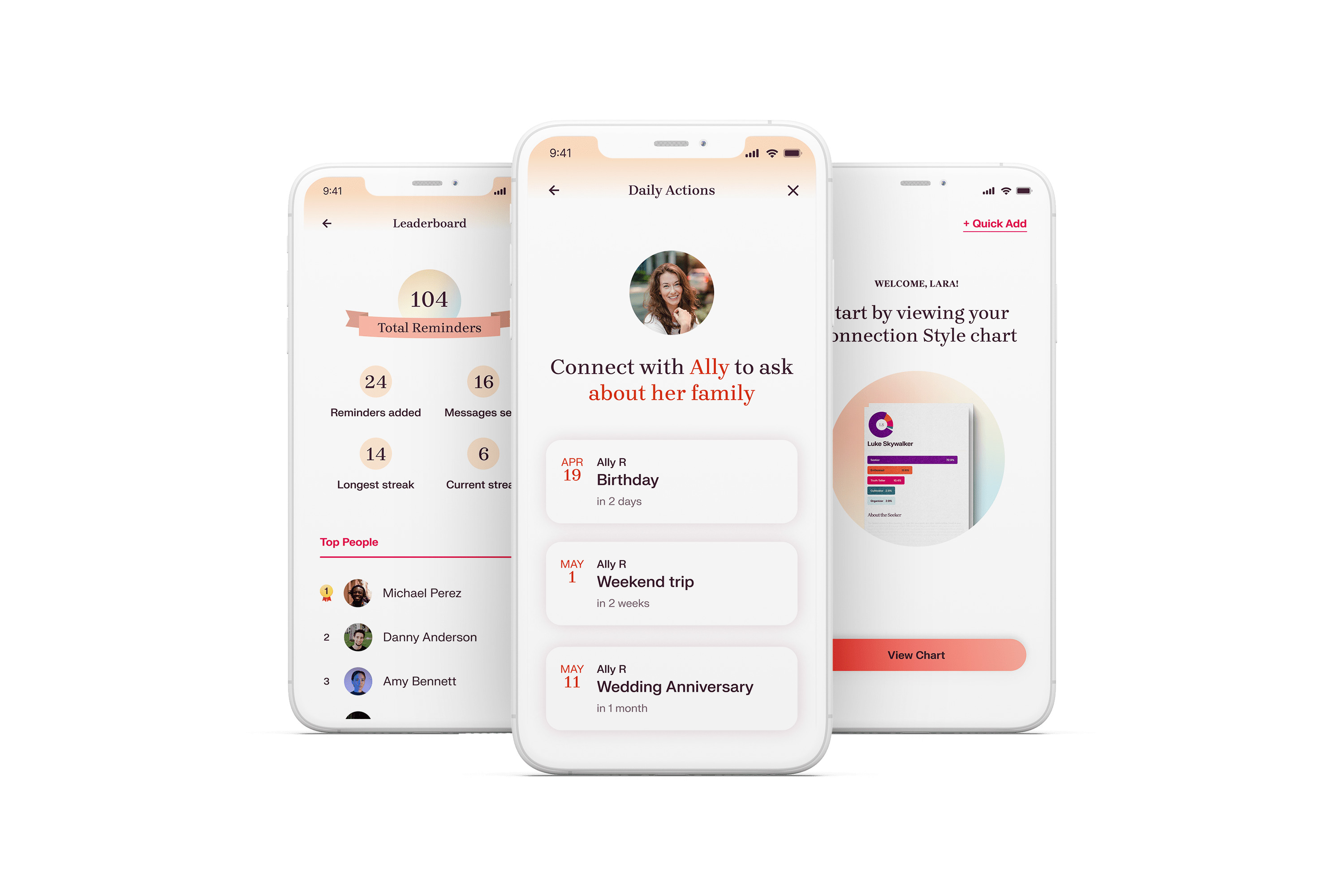
THOUGHTFUL
Boosting Retention by unlocking user ‘Aha’ Moment.
Product discovery • iOS Mobile
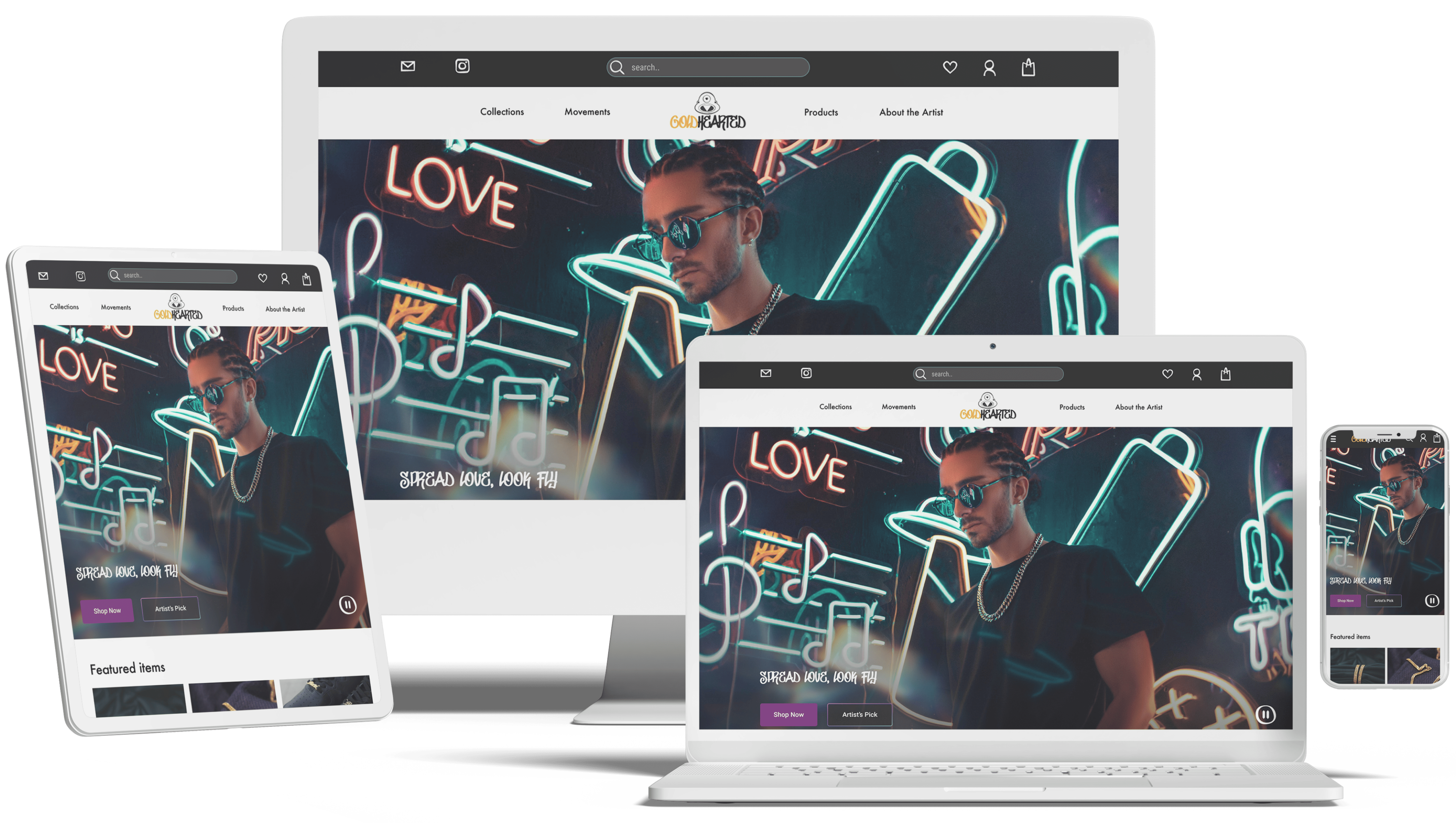
GOLD HEARTED
Rebrand a jewelry company for market fit.
Responsive • E-commerce • Visual

NETFLIX
Enhance accessibility for better control.
Feature redesign • Microinteraction

ANIMAL CARE CENTERS
Feature to reunite lost pets with owners.
Add a feature • Database • AI