


Project
Thoughtful, a VC-backed wellness mobile app startup, aims to help others foster deeper connections by building a utility tool for keeping important notes and information about their people. Users engage in a daily practice that helps them recenter on their people by remembering details and building a habit of reaching out. However, the app doesn’t meet user expectations.
Thoughtful, a VC-backed wellness mobile app startup, aims to help others foster deeper connections by building a utility tool for keeping important notes and information about their people. Users engage in a daily practice that helps them recenter on their people by remembering details and building a habit of reaching out. However, the app doesn’t meet user expectations.
Thoughtful, a VC-backed wellness mobile app startup, aims to help others foster deeper connections by building a utility tool for keeping important notes and information about their people. Users engage in a daily practice that helps them recenter on their people by remembering details and building a habit of reaching out. However, the app doesn’t meet user expectations.
Thoughtful, a VC-backed wellness mobile app startup, aims to help others foster deeper connections by building a utility tool for keeping important notes and information about their people. Users engage in a daily practice that helps them recenter on their people by remembering details and building a habit of reaching out. However, the app doesn’t meet user expectations.
Thoughtful, a VC-backed wellness mobile app startup, aims to help others foster deeper connections by building a utility tool for keeping important notes and information about their people. Users engage in a daily practice that helps them recenter on their people by remembering details and building a habit of reaching out. However, the app doesn’t meet user expectations.
Time
September 2022 (6 weeks)
September 2022 (6 weeks)
September 2022 (6 weeks)
September 2022 (6 weeks)
September 2022 (6 weeks)
Role
Design, Architect, Strategy
Design, Architect, Strategy
Design, Architect, Strategy
Design, Architect, Strategy
Design, Architect, Strategy
Challenge
Stakeholder and user feedback revealed that the app’s layout was confusing and fragmented, hindering product adoption.
Stakeholder and user feedback revealed that the app’s layout was confusing and fragmented, hindering product adoption.
Stakeholder and user feedback revealed that the app’s layout was confusing and fragmented, hindering product adoption.
Stakeholder and user feedback revealed that the app’s layout was confusing and fragmented, hindering product adoption.
Stakeholder and user feedback revealed that the app’s layout was confusing and fragmented, hindering product adoption.
Solution
Introduce a new button within daily action’s interface, consolidating features.
Introduce a new button within daily action’s interface, consolidating features.
Introduce a new button within daily action’s interface, consolidating features.
Introduce a new button within daily action’s interface, consolidating features.
Introduce a new button within daily action’s interface, consolidating features.
Problem
Problem
Problem
Problem
Problem
Thoughtful proudly released its 2.0 app prototype, but feedback was harsh. Stakeholders, including psychiatrists, investors, and the app’s users, all voiced concerns. Users struggled to complete simple tasks due to scattered information and a lack of cohesive flow. The app’s navigation was clunky, features felt disjointed, and the experience didn’t align with the user’s journey.
One user wanted a quick overview of someone they were meeting for dinner but found the relevant information scattered across the app. Another user recounted trying to add a quick note about someone new, only to be led through an extensive input flow that interrupted the social interaction. A third user shared her struggle tracking her friend’s chemotherapy journey, noting that the app didn’t allow her to easily see progress, manage upcoming dates, or adjust check-in frequencies.
We ran mini design sprints to develop Thoughtful 2.0, but the app still felt like a set of separate features rather than a cohesive product.
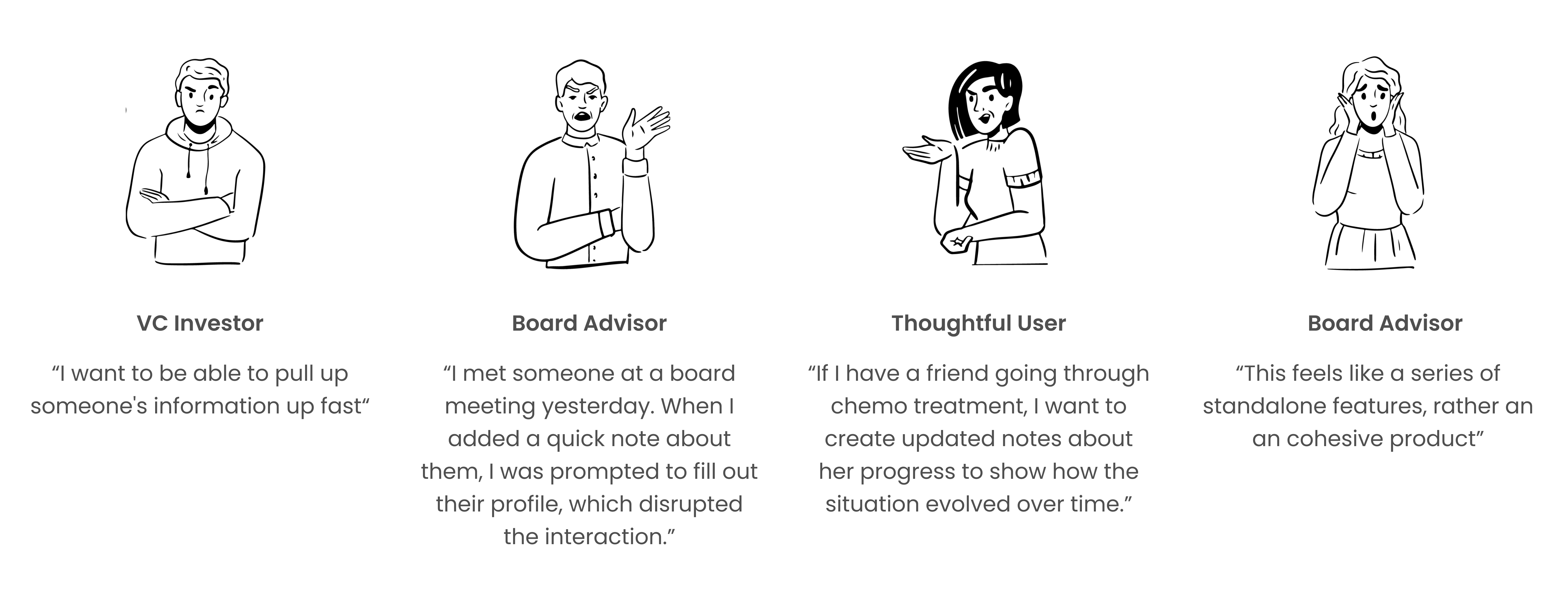
User feedback quotes
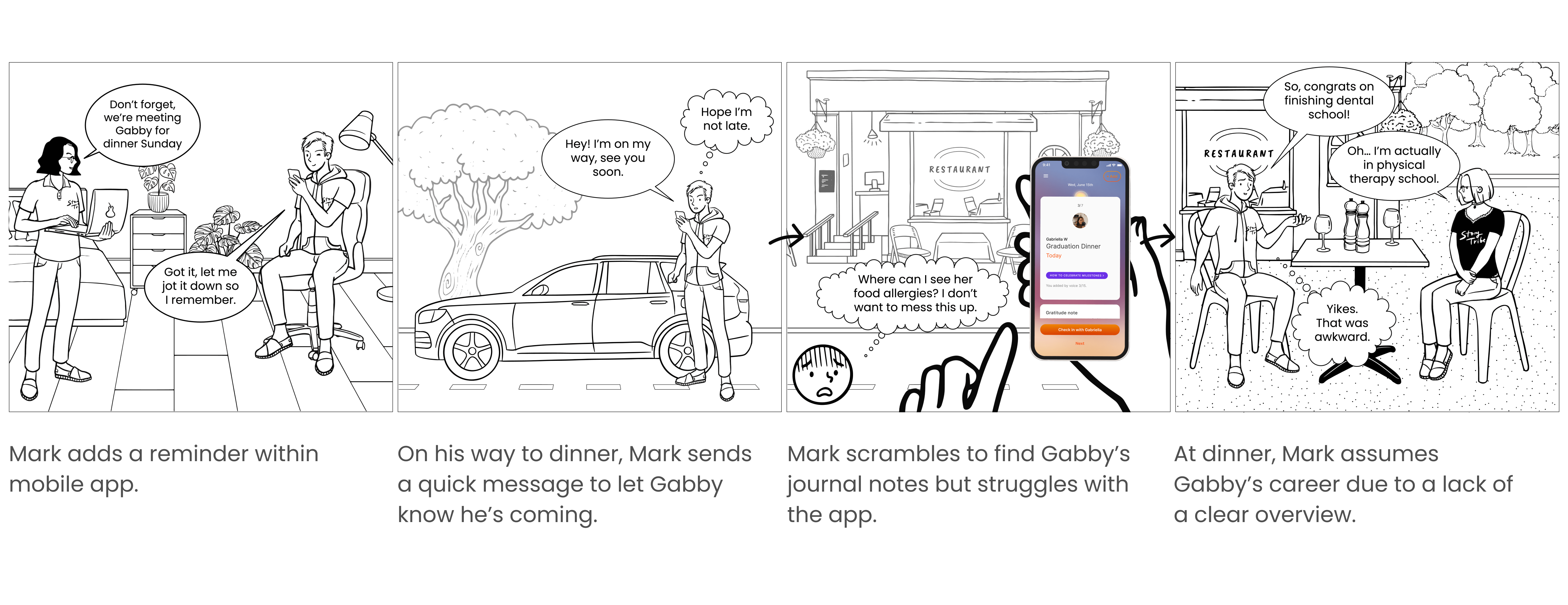
User Journey Map
How might we design a system that offers users more information and task options without overwhelming them?
Approach
Approach
Approach
Approach
Approach
It was clear the app needed a major redesign to meet user expectations and improve usability. The head designer, product owner, and I collaborated to discuss what kind of information would be useful for someone to know about another person (birthday? gift ideas? upcoming dates?) and how best to categorize and organize journal notes so we could resurface information in a way that’s beneficial to the user.
We created an affinity map of every possible thought type a person might want to collect about a loved one. We also updated our daily action user task flow to determine when users could access important information.
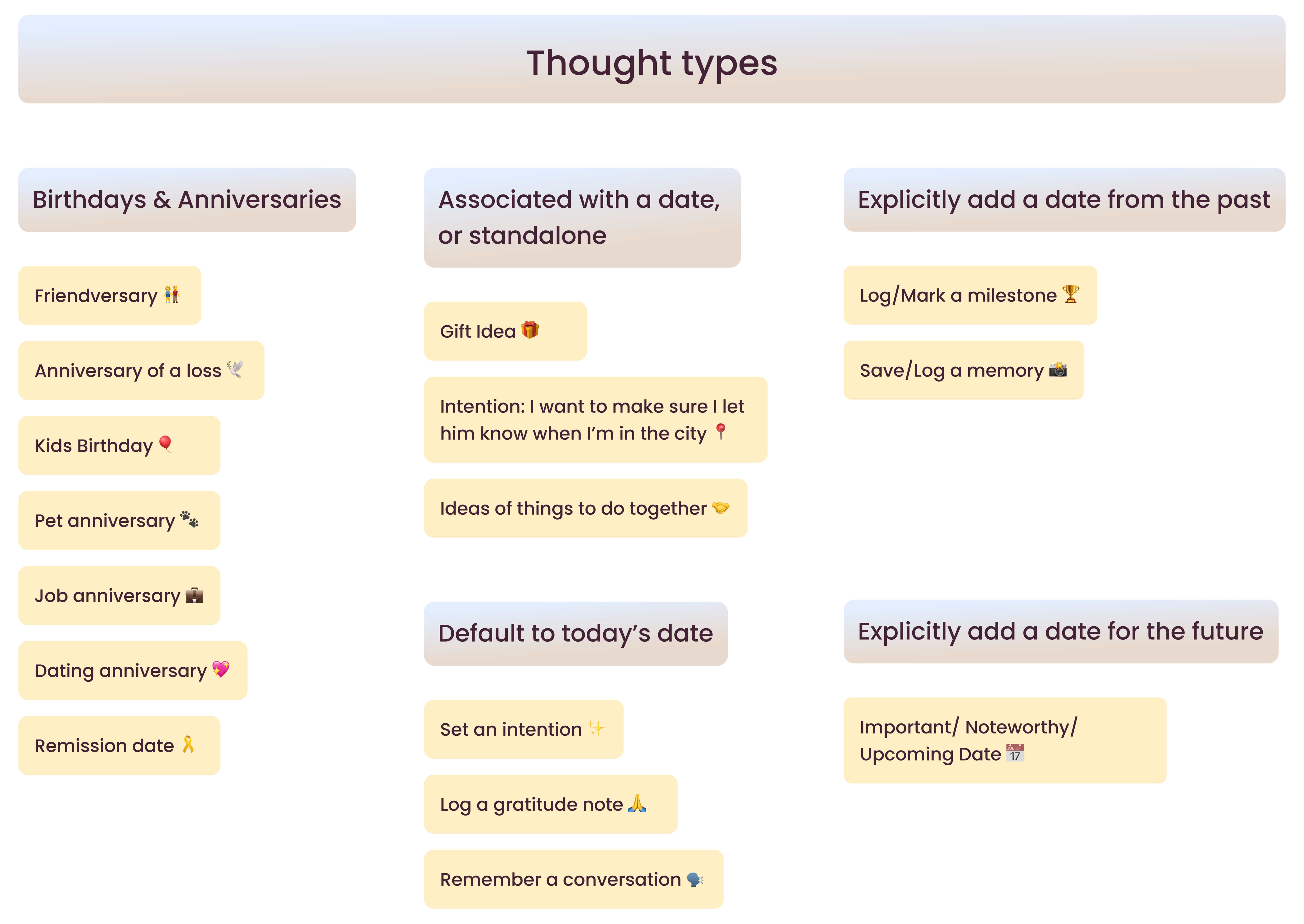
Affinity diagram of thought types
User task flow for Daily Actions (NDA protected)
Given that our diverse user base uses Thoughtful in various ways, a pivotal moment came when the product owner proposed consolidating all information about a person into a single view.
‘Everything?’ I asked.
I liked where the idea was headed, but I brought up concerns about cramming too much into one view and the risk of losing the app’s minimalist feel.
As a result, we developed the concept of a “Cheat Sheet”—a concise, accessible view that aggregates key information about each person. This would give users a quick snapshot without requiring them to dig through the app.
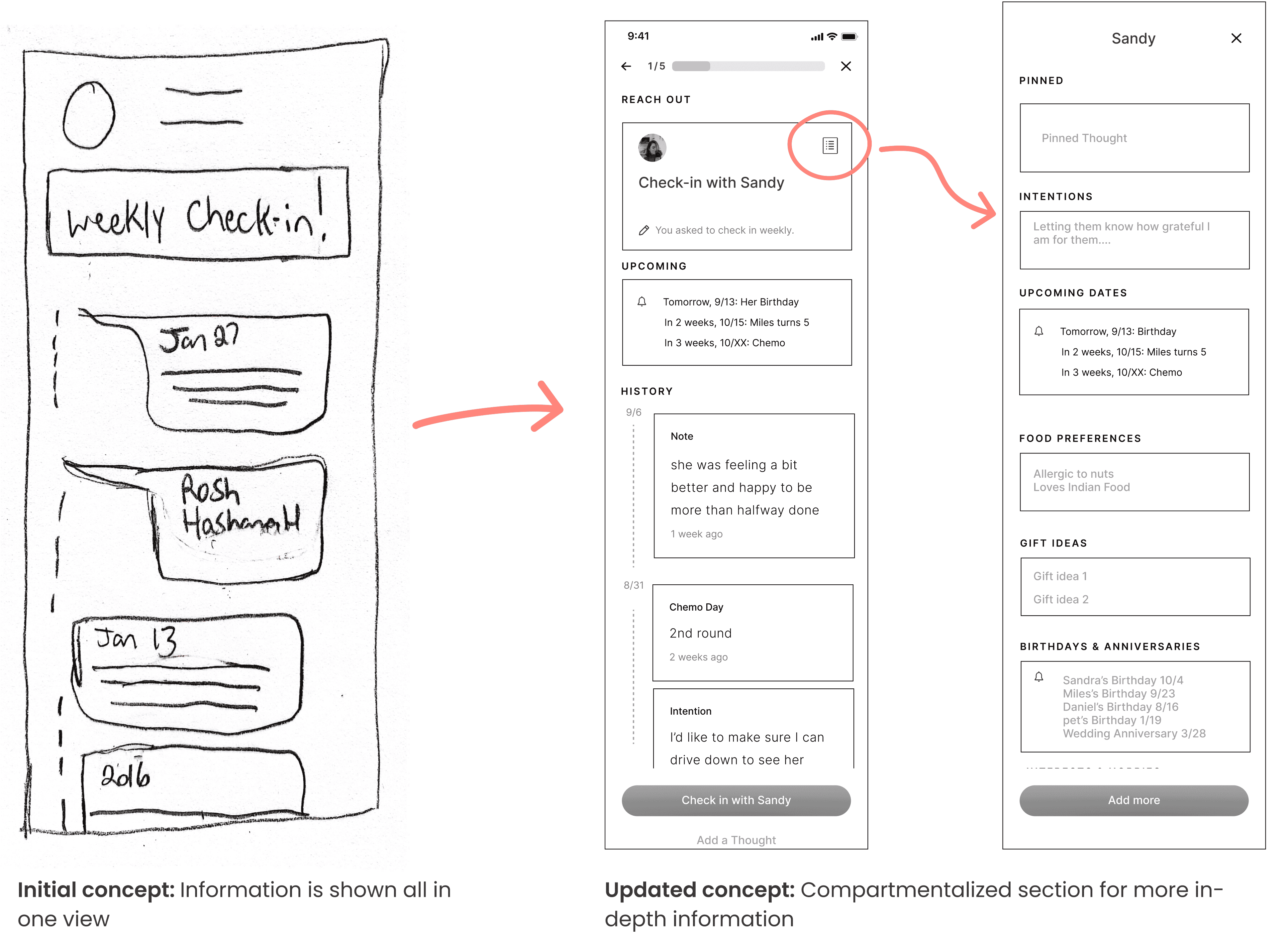
Low fidelity wireframe exploration v1.0 & v2.0
Ideation
Ideation
Ideation
Ideation
Ideation
The “Cheat Sheet” addressed the need for quick overviews, however lacked functionality for:
- Setting reminders to check in.
- Adding quick notes post-interaction.
- Adjusting connection frequencies and reachout intention.
I conducted a competitive analysis to explore how other apps integrated additional actions without clutter. Pinterest’s tap-to-reveal feature inspired me, but I worried if users might miss it as it lacks a clear indicator.
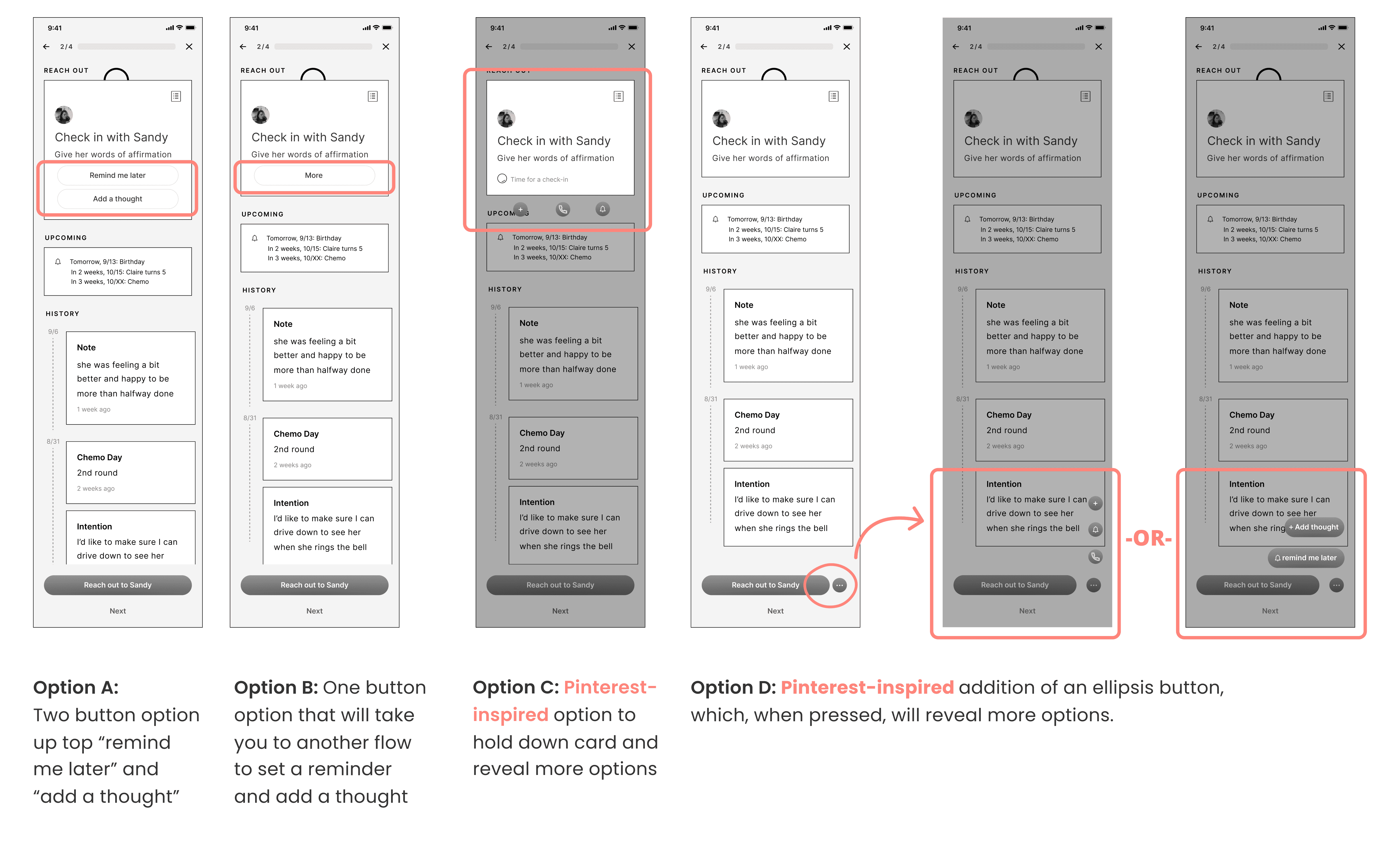
Low fidelity wireframe exploration v3.0
Iteration
Iteration
Iteration
Iteration
Iteration
We prototyped multiple solutions and landed on solution D, which involved adding a new button at the bottom of the app's footer. Following best practices, we wanted to keep the number of actions users see at any given time to less than four. Option D allowed us to hide certain tasks while still giving users a clear signifier that more actions were available, letting them customize their experience as needed.
To maximize interface space, we made the strategic choice to also conceal the “cheat sheet” within the ellipsis button.
This solution balanced simplicity and functionality, offering users the tools they needed without overwhelming them.
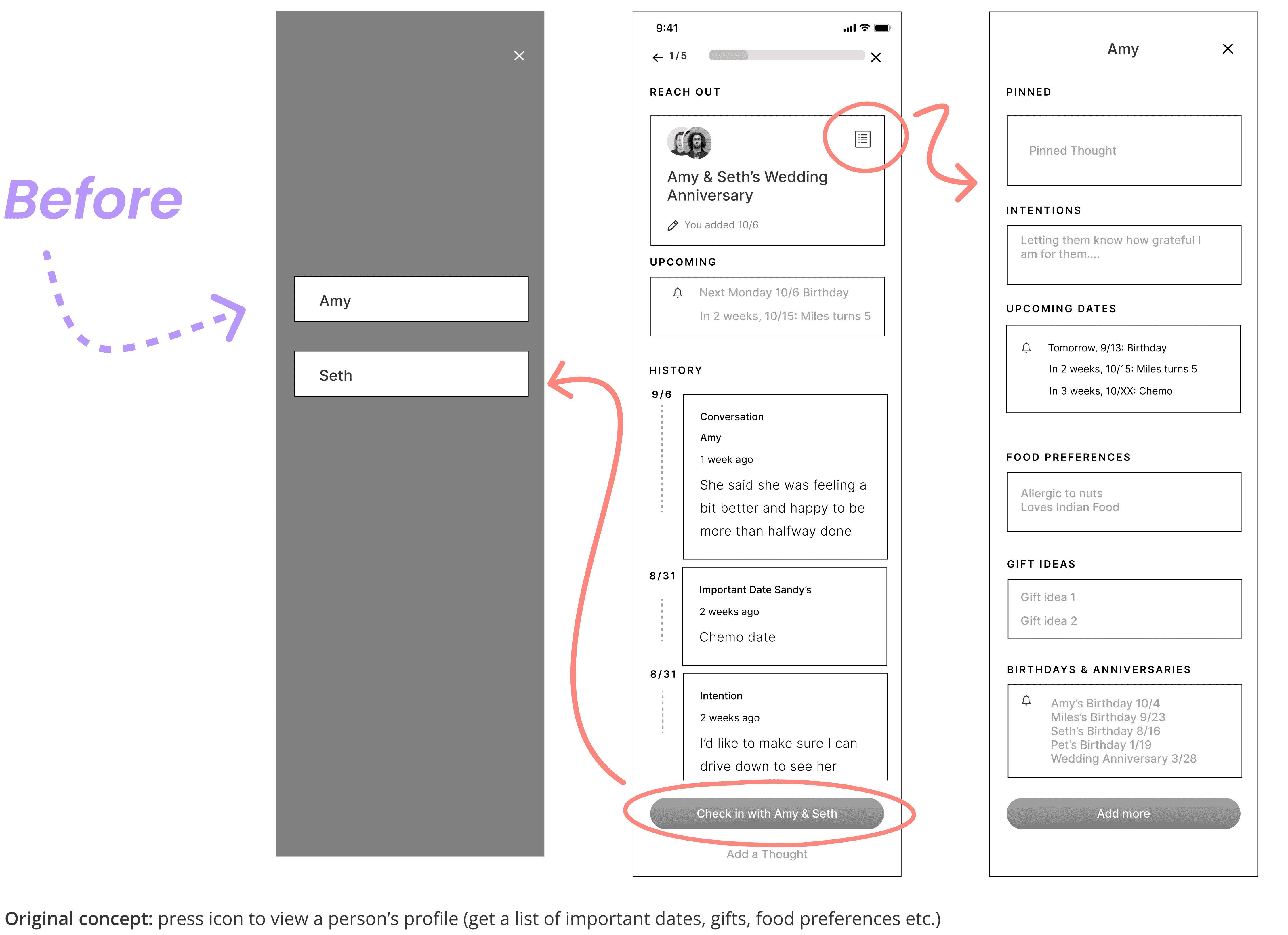
Low fidelity wireframe exploration v2.0
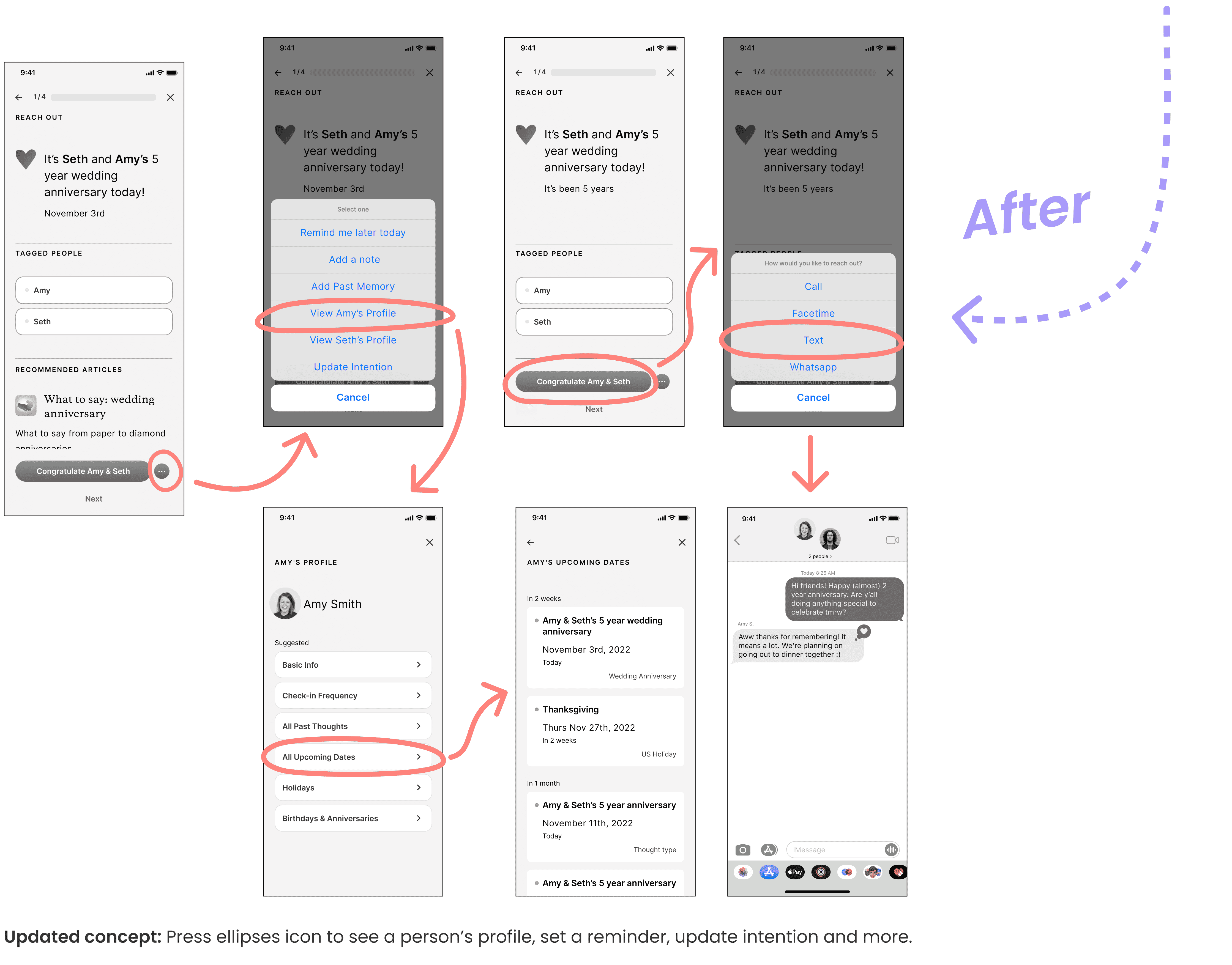
Low fidelity wireframe exploration v3.0
End Product
End Product
End Product
End Product
End Product
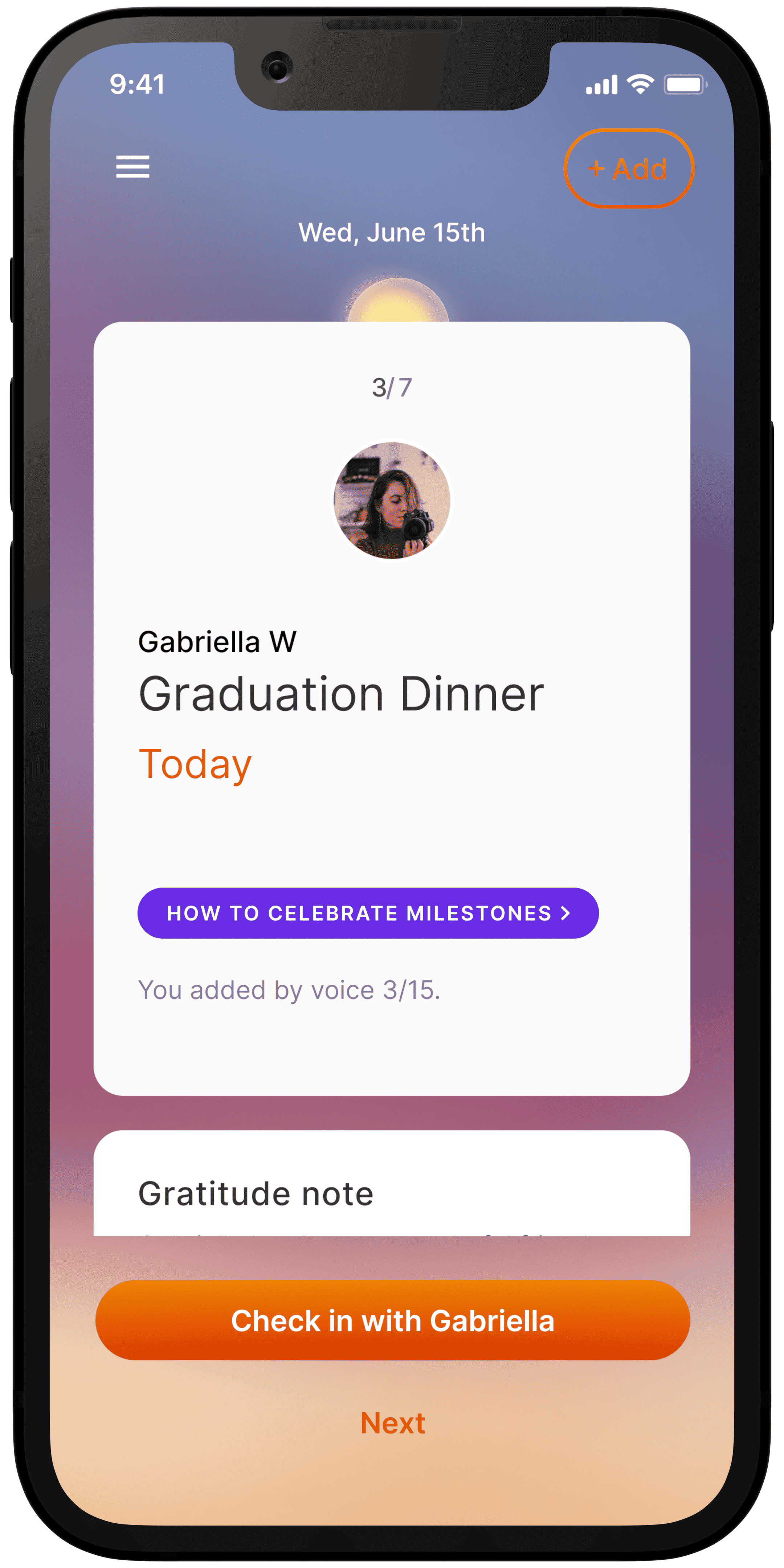
Original high-fidelity design

Updated high-fidelity design with consolidated features
Reflection
Reflection
Reflection
Reflection
Reflection
By listening to real user stories, we identified gaps in the original app and developed solutions that better aligned with users’ needs and journeys. This project reinforced the importance of balancing features with cognitive simplicity, ensuring users can navigate information without feeling overwhelmed.
If I could revisit this project, I would prioritize early usability testing of the “Cheat Sheet” concept to validate its effectiveness sooner.
Ultimately, this redesign helped Thoughtful create a more cohesive and intuitive app, empowering users to build meaningful connections more efficiently.
More projects
More project
More projects
More Projects
More Projects
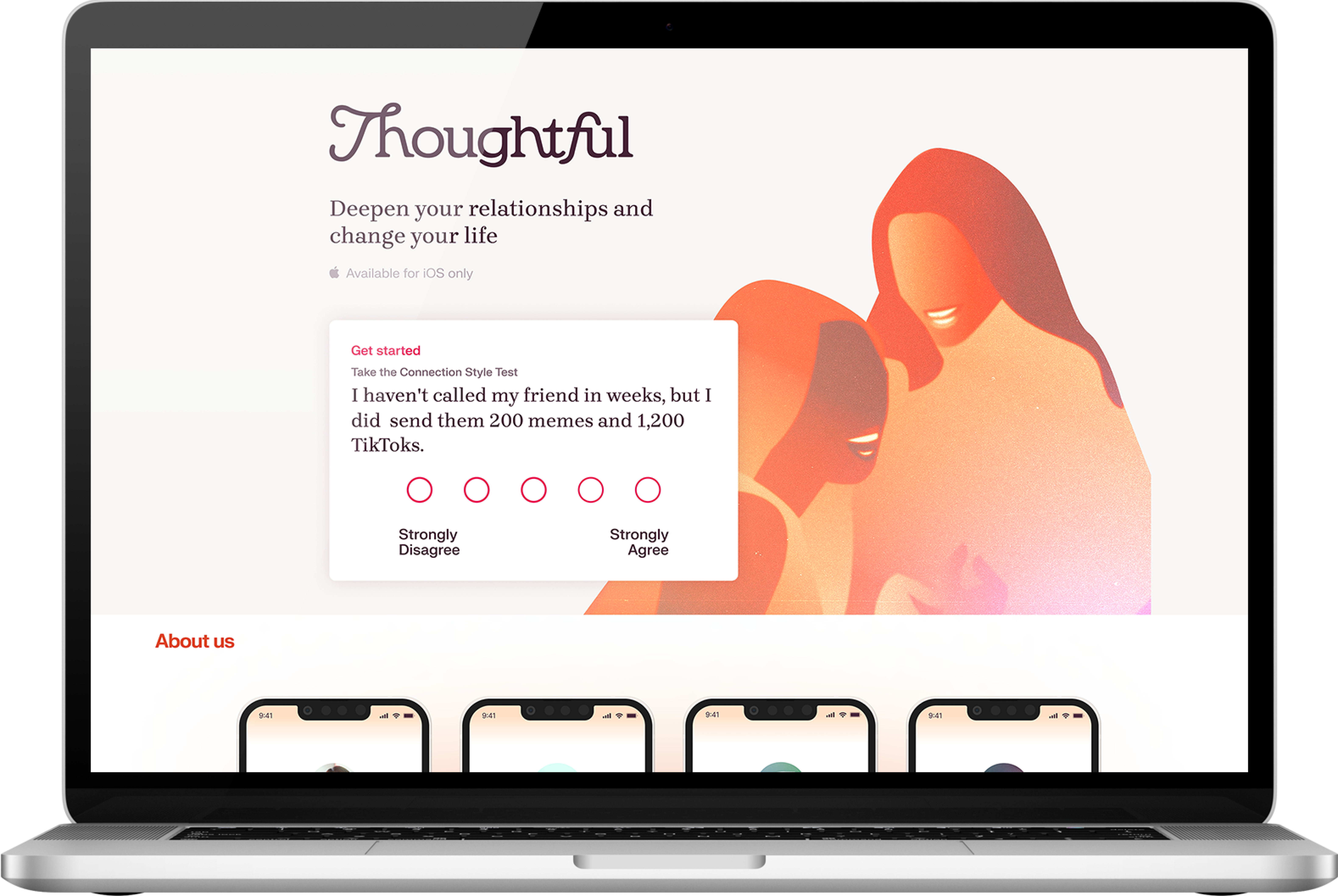
THOUGHTFUL
Fixing a leaky customer funnel.
Growth • B2C SaaS • Animation
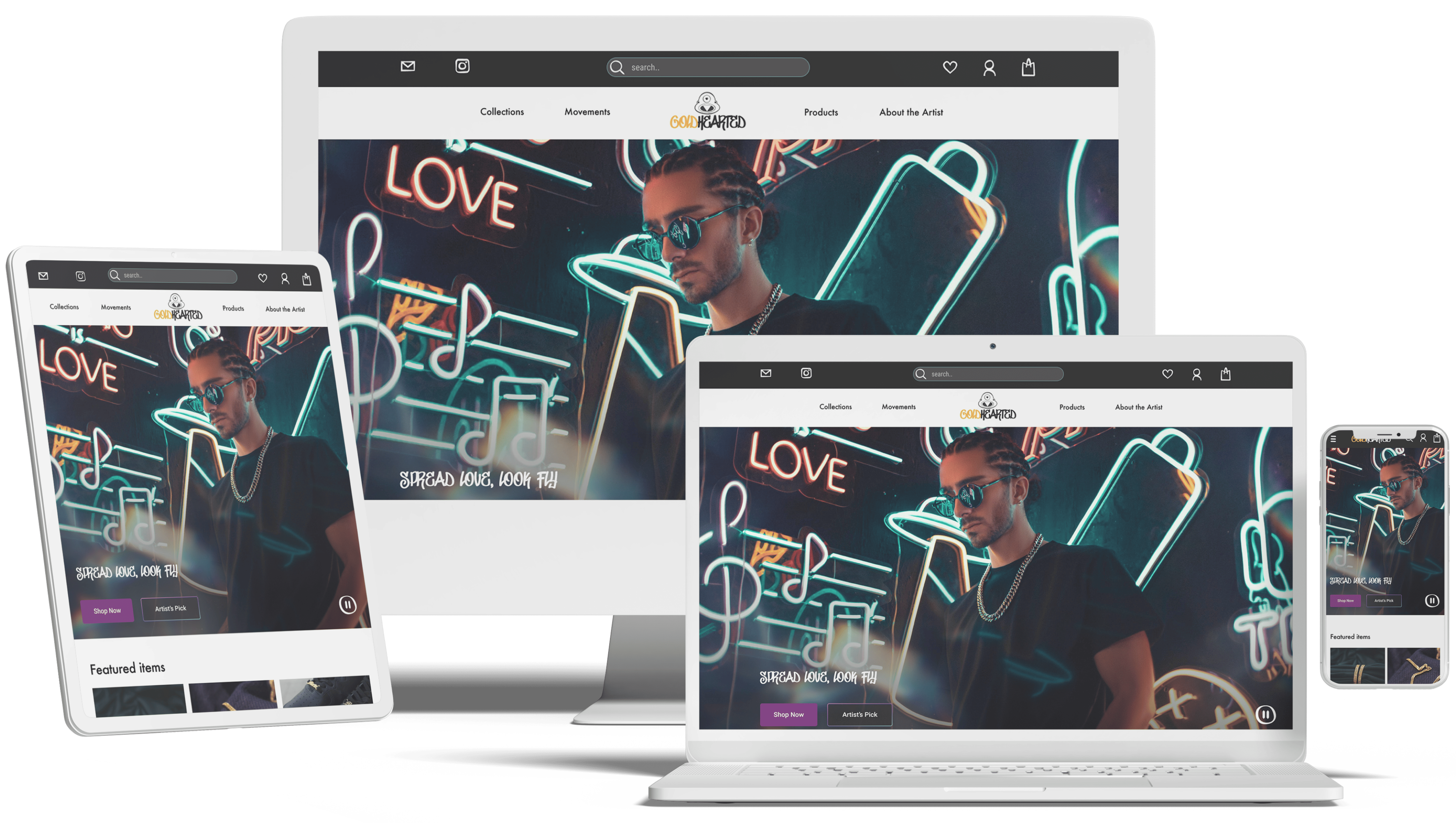
GOLD HEARTED
Rebrand a jewelry company for market fit.
Responsive • E-commerce • Visual

NETFLIX
Enhance accessibility for better control.
Feature redesign • Microinteraction

ANIMAL CARE CENTERS
Feature to reunite lost pets with owners.
Add a feature • Database • AI